What font should I choose for my thesis?
This post is by DrJanene Carey, a freelance writer and editor based in Armidale NSW. She occasionally teaches academic writing at the University of New England and often edits academic theses, articles and reports. Her website is http://www.janenecarey.com
Arguably, this question is a classic time waster and the student who poses it should be told to just get on with writing up their research. But as someone who edits theses for a living, I think a bit of time spent on fonts is part of the process of buffing and polishing what is, after all, one of the most important documents you will ever produce. Just bear in mind that there is no need to immerse yourself so deeply in the topic that you start quibbling about whether it’s a font or a typeface that you are choosing .
Times New Roman is the standard choice for academic documents, and the thesis preparation guidelines of some universities stipulate its use. For many years, it was the default body text for Microsoft Word. With the release of Office 2007, the default became a sans serif typeface called Calibri. Lacking the little projecting bits (serifs) at the end of characters makes Calibri and its many friends, such as Arial, Helvetica and Verdana, look smoother and clearer on a screen, but generally makes them less readable than a serif typeface when used for printed text . The other problem with choosing a sans serif for your body text is that if you want passages in italics (for example, lengthy participant quotes) often this will be displayed as slanted letters, rather than as a true italic font.
You would like your examiners to feel as comfortable as possible while their eyes are traversing the many, many pages of your thesis, so maximising legibility and readability is a good idea. Times New Roman is ubiquitous and familiar, which means it is probably the safest option, but it does have a couple of drawbacks. Originally designed for The Times in London, its characters are slightly narrowed, so that more of them can be squished into a newspaper column. Secondly, some people intensely dislike TNR because they think it has been overused, and regard it as the font you choose when you are not choosing a font .
If you do have the luxury of choice (your university doesn’t insist you use Times New Roman, and you have defined document styles that are easy to modify, and there’s enough time left before the submission deadline) then I think it is worth considering what other typefaces might work well with your thesis. I’m not a typographical expert, but I have the following suggestions.
- Don’t use Calibri, or any other sans serif font, for your body text, though it is fine for headings. Most people agree that dense chunks of printed text are easier to read if the font is serif, and examiners are likely to expect a typeface that doesn’t stray too far from the standard. To my eye, Calibri looks a little too casual for the body of a thesis.
- Typefaces like Garamond, Palatino, Century Schoolbook, Georgia, Minion Pro, Cambria and Constantia are all perfectly acceptable, and they come with Microsoft Word. However, some of them (Georgia and Constantia, for example) feature non-lining numerals, which means that instead of all sitting neatly on the base line, some will stand higher or lower than others, just like letters do. This looks nice when they are integrated with the text, but it is probably not what you want for a tabular display.
- Consider using a different typeface for your headings. It will make them more prominent, which enhances overall readability because the eye scanning the pages can quickly take in the hierarchy of ideas. The easiest way to get a good contrast with your serif body text is to have sans serif headings. Popular combinations are Garamond/Helvetica; Minion Pro/Myriad Pro; Times New Roman/Arial Narrow. But don’t create a dog’s breakfast by having more than two typefaces in your thesis – use point sizes, bold and italics for variety.
Of late, I’ve become quite fond of Constantia. It’s an attractive serif typeface that came out with Office 2007 at the same time as Calibri, and was specifically designed to look good in print and on screen. Increasingly, theses will be read in PDF rather than book format, so screen readability is an important consideration. Asked to review Microsoft’s six new ClearType fonts prior to their release, typographer Raph Levien said Constantia was likely to be everyone’s favourite, because ‘Even though it’s a highly readable Roman font departing only slightly from the classical model, it still manages to be fresh and new.’
By default, Constantia has non-lining numerals, but from Word 2010 onwards you can set them to be lining via the advanced font/number forms option, either throughout your document or in specific sections, such as within tables.
Here is an excerpt from a thesis, shown twice with different typefaces. The first excerpt features Calibri headings with Constantia body text, and the second has that old favourite, Times New Roman. As these examples have been rendered as screenshots, you will get a better idea of how the fonts actually look if you try them on your own computer and printer.

Related posts
Should I get an editor for my thesis?
Love the Thesis whisperer and want it to continue? Consider becoming a $1 a month Patreon and get special, Patreon only, extra Thesiswhisperer content every two weeks!

Share this:
The Thesis Whisperer is written by Professor Inger Mewburn, director of researcher development at The Australian National University . New posts on the first Wednesday of the month. Subscribe by email below. Visit the About page to find out more about me, my podcasts and books. I'm on most social media platforms as @thesiswhisperer. The best places to talk to me are LinkedIn , Mastodon and Threads.
- Post (606)
- Page (16)
- Product (6)
- Getting things done (258)
- On Writing (138)
- Miscellany (137)
- Your Career (113)
- You and your supervisor (66)
- Writing (48)
- productivity (23)
- consulting (13)
- TWC (13)
- supervision (12)
- 2024 (5)
- 2023 (12)
- 2022 (11)
- 2021 (15)
- 2020 (22)
Whisper to me....
Enter your email address to get posts by email.
Email Address
Sign me up!
- On the reg: a podcast with @jasondowns
- Thesis Whisperer on Facebook
- Thesis Whisperer on Instagram
- Thesis Whisperer on Soundcloud
- Thesis Whisperer on Youtube
- Thesiswhisperer on Mastodon
- Thesiswhisperer page on LinkedIn
- Thesiswhisperer Podcast
- 12,114,326 hits
Discover more from The Thesis Whisperer
Subscribe now to keep reading and get access to the full archive.
Type your email…
Continue reading
- Color Palettes
- Superhero Fonts
- Gaming Fonts
- Brand Fonts
- Fonts from Movies
- Similar Fonts
- What’s That Font
- Photoshop Resources
- Slide Templates
- Fast Food Logos
- Superhero logos
- Tech company logos
- Shoe Brand Logos
- Motorcycle Logos
- Grocery Store Logos
- Beer Brand Ads
- Car Brand Ads
- Fashion Brand Ads
- Fast Food Brand Ads
- Shoe Brand Ads
- Tech Company Ads
- Motion graphics
- Infographics
- Design Roles
- Tools and apps
- CSS & HTML
- Program interfaces
- Drawing tutorials

The Heineken Logo History, Colors, Font,

Graceful Grays: Timeless Gray Color Palettes
Exploration in Type: What Font Does

The Corona Logo History, Colors, Font,
Design Your Way is a brand owned by SBC Design Net SRL Str. Caminului 30, Bl D3, Sc A Bucharest, Romania Registration number RO32743054 But you’ll also find us on Blvd. Ion Mihalache 15-17 at Mindspace Victoriei
Academic Appeal: The 11 Best Fonts for Academic Papers
- BY Bogdan Sandu
- 26 February 2024

Imagine settling into the rhythm of crafting your academic magnum opus—the words flow, ideas chime, yet it all hinges on how your prose meets the reader’s eye. You’re well aware that the best fonts for academic papers don’t just whisper to the intellect; they shout to the discerning critic in each evaluator. Here unfolds a narrative, not merely of typography but your academic saga’s silent ambassador.
In forging this guide, I’ve honed focus on one pivotal, often underestimated player in the academic arena: font selection .
Navigate through this roadmap and emerge with a treasure trove of legible typefaces and format tips that ensure your paper stands hallmark to clarity and professionalism.
Absorb insights—from the revered Times New Roman to the understated elegance of Arial —paired with indispensable formatting nuggets that transcend mere compliance with university guidelines .
Dive deep, and by article’s end, unlock a dossier of sage advice, setting your documents a class apart in the scrutinous world of academic scrutiny. Here’s to typography serving not just as a vessel but as your ally in the scholarly discourse.
The Best Fonts for Academic Papers
Traditional choices and their limitations, times new roman : ubiquity and readability vs. overuse.

The Pittsburgh Penguins Logo History, Colors, Font, And Meaning
The dallas stars logo history, colors, font, and meaning.

You may also like

Ad Impact: The 19 Best Fonts for Advertising
- Bogdan Sandu
- 20 December 2023

T-Shirt Typography: 30 Best Fonts for T-Shirts
- 21 December 2023
Great fonts for a PhD thesis – and terrible ones
There are thousands of fonts out there – which one should you choose for a great-looking PhD thesis? I will explain the differences between serif and sans-serif fonts, what ligatures are and why you shouldn’t use that fun free font you found on the internet.
Great fonts for a PhD thesis: Serif vs. sans-serif
As I explained in my Ultimate Guide to preparing a PhD thesis for printing , there are two basic kinds of fonts: Serif fonts and sans-serif fonts. Serif fonts have small lines – serifs – at the ends of all lines. Sans-serif fonts don’t have those lines. Compare these two, Palatino Linotype and Arial:

Serifs guide the reader’s eyes, making sure that they stay in the same line while reading a printed text. In turn, your reader’s brain won’t get tired so quickly and they can read for longer.
But there is another feature that many serif fonts have. Look at these three (which are all great fonts to use in your PhD thesis, btw):

If you look closely, you will see that serif fonts often have different stroke thicknesses within every letter. This is called “weight contrast”. A subtle weight contrast further improves legibility of a printed text. Hence, I recommend you use a serif font with a bit of a weight contrast for your main text.
Which serif font should you choose?
But whatever you do, this one thing is extremely important: Choose a font that offers all styles: regular, italics , bold , and bold italics . Since these four styles all need to be designed separately, many fonts don’t offer all of them. Especially bold italics is absent in most free internet fonts and even from many fonts that come with your operating system or word processor.
Also: In your bibliography and in-text citations (if you go with an author-year citation style) you will have to display author’s names from all over the world. Many of them will contain special letters. For example German umlauts (ä, ö, ü), accented letters used in lots of of languages, i.e. French or Spanish (à, é, ñ, etc.), and dozens of other special letters from all kinds of languages (ç, ı, ł, ø, etc.). Be aware that only a very limited number of fonts offer all of these!
If you have mathematical equations in your thesis that require more than +, – and =, your font choices are limited even further . After all, the vast majority of fonts do not offer special operators.
As you can see, these criteria severely limit your choice of font for the main text. Needless to say, they rule out free fonts you can download from dafont.com or 1001fonts.com . That is why I urge you to go with a classic font. To make things easier for you, here is a table with serif fonts that offer all the characters you could dream of:
Failsafe serif fonts for your PhD thesis
These fonts are heavily based on fonts that have been in use since the invention of the mechanical printing press in the 15th century. Hence, these types of fonts have been tried and tested for more than 500 years. Hard to argue with that!
But which of these fonts is The Best TM for a PhD thesis? That depends on how much text you have in your thesis vs. how many figures, tables, equations, etc. As I have noted in the table, fonts have different widths. Look at this image showing the same text in Times New Roman (TNR), Cambria, and Sitka Text; all at the same size:
Hence, setting entire pages of text in TNR will make the page look quite dense and dark. So, a thesis with a lot of text and few figures is best set in a wider font like Sitka Text. On the other hand, if you have a lot of figures, tables, etc., TNR is a good choice because it keeps paragraphs of text compact and therefore the page from looking too empty. Medium-width fonts like Cambria are a good compromise between the two.
To see some of these fonts in action, check out this example PhD thesis where I show all sorts of font combinations and page layouts.
When to use a sans-serif font in your PhD thesis
This covers serif fonts. But which sans-serif fonts are great for your PhD thesis? And when do you use them?
As mentioned above, serif fonts are good for the main text of your thesis. But titles and headings are a different story. There, a sans-serif font will look very nice. Plus, using a different font in your headings than in the main text will help the reader recognize when a new section begins.
Here are some examples for good sans-serif fonts:

Each of these fonts – Futura, Franklin Gothic Book, and Gill Sans – are wonderful for headings in a PhD thesis. Why? Because they are easily readable, well-balanced and don’t call undue attention to themselves. Also, they have many options: regular, light, medium, bold, extra bold, including italics for all of them. And most operating systems or word processors have them pre-installed.
The criteria for heading fonts are not nearly as strict as those for main text fonts. If you have Latin species names in your headings, make sure the font offers (bold) italics. If you need to display Greek letters in your headings, make sure the font offers those. Done.
However, there are some criteria for headings. Just for fun, let’s have a look at some sans-serif fonts that would be a bad choice for a thesis:

I’d like to explicitly state that these are wonderful, well-designed fonts – you just shouldn’t use them in a scientific document. Heattenschweiler is too narrow, Broadway has too much weight contrast and Aspergit Light is too thin. All of these things impair readability and might make your opponents squint at your headings. Of course, you will want to do everything in your power to make the experience of reading your thesis as pleasant a possible for your opponents!
How are these fonts great for my PhD thesis? They are boring!
Why yes, they are, thanks for noticing!
Seriously though, the fonts not being interesting is the point. Your PhD thesis is a scientific document showing your expertise in your field and your ability to do independent research. The content of your thesis, the science, should be the sole focus. A PhD thesis is not the place to show off your quirky personality by way of an illegible font.
However, you can infuse your personality into your thesis cover and chapter start pages. There, you can use a fun font, since you probably don’t have to display any special characters.
Choosing the right font is too much pressure? Contact me for help with your layout!
Don’t use fonts made for non-Latin alphabets (Cyrillic, Hanzi, etc.)
Every computer nowadays comes pre-installed with a number of fonts made for displaying languages that don’t use the Latin alphabet (Latin alphabet = The alphabet in which this very article is displayed). Prominent examples for languages that don’t use the Latin alphabet are Asian languages such as Chinese, Japanese, Korean, Thai, etc. Other examples include the Arabic, Brahmic, and Cyrillic script. But there are many more fonts for a myriad of non-Latin alphabets. These fonts were optimized to make the characters of their languages easily readable.
However (and this is why I’ve written this entire section) they usually also contain Latin characters to be able to display the occasional foreign word.
Hence, you might want to honour your roots by using a font in your thesis that was made for your native language, by someone from your home country. It is tempting, because all the Latin characters are there, right? I completely understand this wish, but I strongly advise against it since there are some serious drawbacks.
Don’t get me wrong, I’m not throwing shade on these fonts, they are fantastic at what they were made for. Displaying long stretches of text in the Latin alphabet, however, is not one of those things. Let me explain why.
They don’t offer all necessary characters
Firstly, fonts made to display languages with a non-Latin alphabet contain the bare minimum of Latin characters. That is, the basic letters and the most important punctuation marks. Hence, they don’t have all those math operators and special characters I talked about in the section about serif fonts.
Also, the Latin characters in these fonts are usually sans-serif, so less suitable for long text.
But let’s say the non-Latin alphabet font you chose does offer all special characters and has serifs. Unfortunately, they are still not suitable to use in your PhD thesis, for the following reasons:
They are often too small or large for use with greek letters
Do you mention β-Mercaptoethanol or α-Histidin antibodies in your Materials and Methods? Or any other Greek letter? Since Latin characters are scaled differently in fonts made for non-Latin alphabets, Greek letters will not be the same size as the rest of the text anymore. For example, look at this text, where I rendered everything (I swear!) in the specified font size:

In the first panel (Cambria), the Greek letters are the same size and weight as the main text. As I have said, Cambria is one of the fonts explicitly recommended for your thesis. If you look closely at the enlarged line on the bottom of the panel, you can see that the alpha is the same height as the lower-case letters, whereas the beta is the same height as the upper-case letters. It looks neat and tidy.
However, by using a non-Latin font for your PhD thesis, you are asking for trouble.
In the second panel, I show Cordia New, a font for Thai script. At 12 pt, it is way smaller than the Latin font. The Greek letters – which are also at 12 pt! – stand out awkwardly. Also, Cordia New produces a line distance that is larger than it should be when using it for a text in the Latin alphabet.
In the last panel I show Microsoft YaHei for displaying Hanzi characters. Here, the Latin characters are larger. This leads to the Greek letters being too small. And, as you can see in the second and third lines of the paragraph of text, the line distance is quite narrow. However, the Greek letter β requires a regular line distance. So, it pushes the following line down, making the paragraph look uneven.
They don’t offer ligatures
Now, what on earth are ligatures? I could dive into the history of book printing here but I’ll spare you those details. In essence, Ligatures are two or more letters that are printed as one single glyph. Let me show you:

In the top line, you can see that the characters inside the boxes “melt” into each other. This single shape made out of several letter is called a ligature. They are mostly common with the small letter f. If you take a magnifying glass and look at the pages of a novel, you will quickly find these same ligatures. E-readers also display ligatures. Heck, even WhatsApp does it!
Ligatures also make the text easier to read. However, in order to display them, a font actually has to have the glyphs for the ligatures. And many fonts don’t. In order to find out whether a font you chose offers them, go to the character map of that font. (In Windows 10, simply click the windows logo in the corner of your screen and start typing the word “character”.) Pick a font in the drop-down menu. Now, search for the word “ligature” in the character map. If the map is empty after this, the font has no ligature glyphs.
All that being said, ligatures are not super important. I just wanted to mention them.
You can still use fonts made for non-Latin alphabets
If you want to honour your roots by way of a font, you can still do this. For example in your thesis title and/or for the chapter start pages.
In a word: Don’t go crazy with those fonts! Let your science do the talking. If you want to see what your thesis could look like with some of the fonts I recommended, check out the example PhD thesis .
Do you want to see a font combination that’s not in the example thesis? Contact me and I’ll set a few pages in your desired font, free of charge!
Click here for help with your PhD thesis layout!
Bedrijvsgegevens | About
Privacyverklaring | Privacy Policy
+61 481607654
8 Best Fonts for Thesis Writing to Make It Presentable

Table Of Contents
How do font plays a critical role in thesis, 8 best fonts for thesis writing, tips to choose the best font for thesis, mistakes to avoid while choosing a font, how to format your thesis perfectly.
- Can’t Write a Thesis? Let Our Experts Do It for You
When your professor assigns you a thesis, he excepts it to be perfect at the time of submission. The textual content of the document is the utmost source of information. So, while creating content, you should take care of the font selection. Choosing the best font for the thesis provides an attractive appearance and preserves the aesthetic value of your document. Also, the font professionally presents information. Choosing font in both ways (either online or printed form) of the thesis is crucial. If you are submitting it online, then the font makes a difference in the readability. If you are providing it in the printed form, then the font reflects professionalism.
You May Like This: The Complete Guide to Breaking Down a 10000-Word Dissertation
Sometimes, it is questioned that why the font is necessary. Well, the font is as mandatory as the content. You should know that everything is in proper fonts for the thesis.
- To highlight headings, you can use bold and stylish fonts.
- To highlight the subheadings, you can use italic and cursive fonts.
- The information that you want to convey must be in a simple and decent font.
This particular formula will grab the reader’s attention to your document. If you don’t focus on the font, then your document will look imprudent. It can create a bad impact on your professor. If you don't show creativity while writing, then the reader will get bored and won’t show interest in your document. So, make sure to always use different fonts in the thesis according to the needs. Now, let’s talk about some of the most appropriate fonts included in the thesis.
This Might Be Helpful: A to Z of Assignment Writing: Everything You Need to Know About It
A thesis can look presentable if you include appropriate fonts in it. The following fonts will create a positive impression on your professor. Let’s take a look:
- Times New Roman Times New Roman was particularly designed for Times Newspaper for London. This font has a separate and different value in a formal style. Most of the universities and colleges suggest students use this font in a document.
- Georgia Georgia font was designed in 1883, especially for Microsoft Corporation. This is the best font for the students who want to submit the document online. It is preferred for the elegant and small appearance for low-resolution screens.
- Serif Serif is originated from Roman from a font written on a stone. Earlier, this font was not accepted universally. The specialty of this font is that every alphabet has a small line or stroke attached to the end of the larger stroke.
- Garamond Garamond is usually used for book printing and body text. If you want to write the main body or long paragraphs, then you can use this font. It is simple and easy to read.
- Cambria Cambria is founded by Microsoft and later distributed with Windows and Office. This font is the easiest to read in a hurry because it contains spaces and proportions between the alphabets. This is suitable for the body and the long sentence.
- Century Gothic Century Gothic is basically in the geometric style released in 1881. This font has a larger height instead of other fonts. If the university allows you to choose the font of your own choice, you can go for this one.
- Palatino Linotype Palatino Linotype font is highly legible for online documents. It enhances the quality of the letter when displayed on the screen. This font is majorly used for books, periodicals, and catalogs.
- Lucida Bright Lucida Bright has a unique quality that the text looks larger at smaller point sizes also. This font can fit words on a single line. To write a thesis, you can choose this font easily.
After getting brief knowledge about the fonts, let's now come to the tips to choose the best font for the thesis. Here are some major key points that you should follow while choosing a font.
- Make sure your font looks attractive.
- It should match your tone.
- Headings and subheadings must be highlighted.
- It should not look congested.
- Avoid choosing complicated or fancy fonts.
Take a Look: How to Write a Good Thesis Statement for an Essay? Best Tips & Examples
Students make some mistakes while choosing a font, which the professor dislikes the most. So, to avoid those, keep the below points in mind.
- Don’t choose fonts on your likes and dislikes.
- Put the reader's preference first and then choose the font.
- Avoid too many fonts as they make the work look unorganized.
- Make sure all fonts match your document instead of making it look like a disaster.
- Choose different fonts for titles, subtitles, paragraphs.
When preparing the thesis for submission, students must follow strict formatting requirements. Any deviations in these requirements may lead to the rejection of the thesis.
- The language should be perfect.
- The length of the thesis should be divided appropriately among the sections.
- The page size, margins, and spacing on the page should be correct.
- The font and point size should be displayed correctly.
Can't Write a Thesis? Let Our Experts Do It for You
The experts of Assignment Prime warmly welcome everyone who seeks help with thesis writing service . A thesis is one of the toughest academic papers to write for students. It takes a great amount of time, rigorous research, and perfect writing skills to complete it. To make this easy for you, the experts are here to help you write the thesis and the font selection for every section.
We are known for offering unmatched assistance with thesis and dissertation writing to students across the globe. Our professionals deliver a well-researched and informative academic paper before the deadline. We also provide help to students in research, topic selection, editing, proofreading, etc. So, stop searching for help and quickly start ordering without any delay to avail the best features of Assignment Prime . We are waiting to serve you with the best!
You may like this : How to write a discussion in dissertation

To Make Your Work Original
Check your work against paraphrasing & get a free Plagiarism report!
Check your work against plagiarism & get a free Plagiarism report!
Get citations & references in your document in the desired style!
Make your content free of errors in just a few clicks for free!
Generate plagiarism-free essays as per your topic’s requirement!
FREE Features
- Topic Creation USD 4.04 FREE
- Outline USD 9.75 FREE
- Unlimited Revisions USD 21.6 FREE
- Editing/Proofreading USD 29.26 FREE
- Formatting USD 8.36 FREE
- Bibliography USD 7.66 FREE
Get all these features for
USD 84.3 FREE

Thesis Statement Writing: How Crucial is it? How to Write? & More
![All About Short Essay Writing [Examples Included]](https://www.assignmentprime.com/images/AP_Blog_Image_How_to_Write_a_Short_Essay.jpg "thesis times font")
All About Short Essay Writing [Examples Included]

How to Write a Letter of Reference with Templates?

Experts' Guidance on How to Conduct Nike’s SWOT Analysis

Avail the Best Assignment Writing Services in Just One Tap!
Add "5% extra off on app"
We use cookies to ensure that we give you the best experience on our website. If you continue to use this site we will assume that you are happy with it. Know more

Please rotate your device
We don't support landscape mode yet. Please go back to portrait mode for the best experience
- KU Libraries
- Subject & Course Guides
- KU Thesis and Dissertation Formatting
- Fonts and Spacing
KU Thesis and Dissertation Formatting: Fonts and Spacing
- Formatting Specifics
- Title and Acceptance Pages
- Page Numbering
- Table of Contents
- List of Figures
- Rotating Charts or Tables
- Working with Footnotes
- Converting to PDF
- Embedding Fonts
- Completed KU Dissertations & Theses
- About: Survey of Earned Doctorates
- Copyright and ETD Release Form
- Resources for KUMC Students
- Thesis/Dissertation Filenames
- LaTeX/BibTeX Support
Office of Graduate Studies Thesis and Dissertation Formatting Guidelines
These rules are taken from the KU Office of Graduate Studies Thesis or Dissertation Formatting Guidelines. To see the full thesis or dissertation formatting requirements, visit https://graduate.ku.edu/submitting
- Students should use the same font size (11- or 12-point) and style (typically Times New Roman) through the thesis, including labels and references.
- Tables, captions, and footnotes should use the same font style but may be smaller in size (usually 10-point).
- Chapter and section headings may be bold and no more than 2 points larger than the text size.
- Non-standard typefaces, such as script, are generally not acceptable except for commonly used symbols.
- The Office of Graduate Studies recommends that students get their font choice approved by their department and their graduate division before the thesis defense.
- Lettering and symbols in tables and figures should be no less than 10 points.
- Normally theses and dissertations use double-spaced formatting.
- Single-spaced formatting is acceptable in the table of contents, footnotes, end notes, charts, graphs, tables, block quotations, captions, glossary, appendices and bibliography.
- Students may use singe- or one-and-a-half-spacing for the body of the text with prior written approval of their thesis committee and graduate division.
Subject Guide

- << Previous: Title and Acceptance Pages
- Next: Page Numbering >>
- Last Updated: May 9, 2024 9:48 AM
- URL: https://guides.lib.ku.edu/etd

- Langson Library
- Science Library
- Grunigen Medical Library
- Law Library
- Connect From Off-Campus
- Accessibility
- Gateway Study Center
Email this link
Thesis / dissertation formatting manual (2024).
- Filing Fees and Student Status
- Submission Process Overview
- Electronic Thesis Submission
- Paper Thesis Submission
- Formatting Overview
- Fonts/Typeface
- Pagination, Margins, Spacing
- Paper Thesis Formatting
- Preliminary Pages Overview
- Copyright Page
- Dedication Page
- Table of Contents
- List of Figures (etc.)
- Acknowledgements
- Text and References Overview
- Figures and Illustrations
- Using Your Own Previously Published Materials
- Using Copyrighted Materials by Another Author
- Open Access and Embargoes
- Copyright and Creative Commons
- Ordering Print (Bound) Copies
- Tutorials and Assistance
- FAQ This link opens in a new window
Selecting a Font (Typeface)
Be consistent in the use of font/typeface throughout your manuscript. All text material must be in the same font/typeface; all headings and figure/table titles/captions must be in a consistent typeface.
Please select a font and size that is highly legible and will reproduce clearly. Ornate or decorative fonts such as script, calligraphy, gothic, italics, or specialized art fonts are not acceptable. For electronic submissions, embedded fonts are required.
Any symbols, equations, figures, drawings, diacritical marks, or lines that cannot be typed, and therefore are drawn, must be added in permanent black ink.
Below are suggested fonts and sizes.

Establish and follow a consistent pattern for layout of all headings. All headings should use the same font size, font weight, typeface, etc.
For example: center all major headings; place secondary headings at least two lines below major headings.
Typeface/Printing Quality (Paper Submissions Only)
If you are submitting your manuscript on paper, printer quality is critical to produce a clean, clear image. You are strongly urged to use a laser printer, as ink jet and line printers generally do not produce fully clear, legible results. Dot matrix-type printers are not acceptable.
- << Previous: Formatting Overview
- Next: Pagination, Margins, Spacing >>
- Last Updated: Feb 20, 2024 2:09 PM
- URL: https://guides.lib.uci.edu/gradmanual
Off-campus? Please use the Software VPN and choose the group UCIFull to access licensed content. For more information, please Click here
Software VPN is not available for guests, so they may not have access to some content when connecting from off-campus.
Thesis and Dissertation Guide
- « Thesis & Dissertation Resources
- The Graduate School Home
- Introduction
- Copyright Page
- Dedication, Acknowledgements, Preface (optional)
- Table of Contents
- List of Tables, Figures, and Illustrations
- List of Abbreviations
- List of Symbols
Non-Traditional Formats
Font type and size, spacing and indentation, tables, figures, and illustrations, formatting previously published work.
- Internet Distribution
- Open Access
- Registering Copyright
- Using Copyrighted Materials
- Use of Your Own Previously Published Materials
- Submission Steps
- Submission Checklist
- Sample Pages

II. Formatting Guidelines
All copies of a thesis or dissertation must have the following uniform margins throughout the entire document:
- Left: 1″ (or 1 1/4" to ensure sufficient room for binding the work if desired)
- Right: 1″
- Bottom: 1″ (with allowances for page numbers; see section on Pagination )
- Top: 1″
Exceptions : The first page of each chapter (including the introduction, if any) begins 2″ from the top of the page. Also, the headings on the title page, abstract, first page of the dedication/ acknowledgements/preface (if any), and first page of the table of contents begin 2″ from the top of the page.
Non-traditional theses or dissertations such as whole works comprised of digital, artistic, video, or performance materials (i.e., no written text, chapters, or articles) are acceptable if approved by your committee and graduate program. A PDF document with a title page, copyright page, and abstract at minimum are required to be submitted along with any relevant supplemental files.
Fonts must be 10, 11, or 12 points in size. Superscripts and subscripts (e.g., formulas, or footnote or endnote numbers) should be no more than 2 points smaller than the font size used for the body of the text.
Space and indent your thesis or dissertation following these guidelines:

- The text must appear in a single column on each page and be double-spaced throughout the document. Do not arrange chapter text in multiple columns.
- New paragraphs must be indicated by a consistent tab indentation throughout the entire document.
- The document text must be left-justified, not centered or right-justified.
- For blocked quotations, indent the entire text of the quotation consistently from the left margin.
- Ensure headings are not left hanging alone on the bottom of a prior page. The text following should be moved up or the heading should be moved down. This is something to check near the end of formatting, as other adjustments to text and spacing may change where headings appear on the page.
Exceptions : Blocked quotations, notes, captions, legends, and long headings must be single-spaced throughout the document and double-spaced between items.
Paginate your thesis or dissertation following these guidelines:
- Use lower case Roman numerals (ii, iii, iv, etc.) on all pages preceding the first page of chapter one. The title page counts as page i, but the number does not appear. Therefore, the first page showing a number will be the copyright page with ii at the bottom.
- Arabic numerals (beginning with 1, 2, 3, 4, etc.) start at chapter one or the introduction, if applicable. Arabic numbers must be included on all pages of the text, illustrations, notes, and any other materials that follow. Thus, the first page of chapter one will show an Arabic numeral 1, and numbering of all subsequent pages will follow in order.
- Do not use page numbers accompanied by letters, hyphens, periods, or parentheses (e.g., 1., 1-2, -1-, (1), or 1a).
- Center all page numbers at the bottom of the page, 1/2″ from the bottom edge.
- Pages must not contain running headers or footers, aside from page numbers.
- If your document contains landscape pages (pages in which the top of the page is the long side of a sheet of paper), make sure that your page numbers still appear in the same position and direction as they do on pages with standard portrait orientation for consistency. This likely means the page number will be centered on the short side of the paper and the number will be sideways relative to the landscape page text. See these additional instructions for assistance with pagination on landscape pages in Microsoft Word .

Format footnotes for your thesis or dissertation following these guidelines:

- Footnotes must be placed at the bottom of the page separated from the text by a solid line one to two inches long.
- Begin at the left page margin, directly below the solid line.
- Single-space footnotes that are more than one line long.
- Include one double-spaced line between each note.
- Most software packages automatically space footnotes at the bottom of the page depending on their length. It is acceptable if the note breaks within a sentence and carries the remainder into the footnote area of the next page. Do not indicate the continuation of a footnote.
- Number all footnotes with Arabic numerals. You may number notes consecutively within each chapter starting over with number 1 for the first note in each chapter, or you may number notes consecutively throughout the entire document.
- Footnote numbers must precede the note and be placed slightly above the line (superscripted). Leave no space between the number and the note.
- While footnotes should be located at the bottom of the page, do not place footnotes in a running page footer, as they must remain within the page margins.
Endnotes are an acceptable alternative to footnotes. Format endnotes for your thesis or dissertation following these guidelines:

- Always begin endnotes on a separate page either immediately following the end of each chapter, or at the end of your entire document. If you place all endnotes at the end of the entire document, they must appear after the appendices and before the references.
- Include the heading “ENDNOTES” in all capital letters, and center it 1″ below the top of the first page of your endnotes section(s).
- Single-space endnotes that are more than one line long.
- Number all endnotes with Arabic numerals. You may number notes consecutively within each chapter starting over with number 1 for the first note in each chapter, or you may number notes consecutively throughout the entire document.
- Endnote numbers must precede the note and be placed slightly above the line (superscripted). Leave no space between the number and the note.
Tables, figures, and illustrations vary widely by discipline. Therefore, formatting of these components is largely at the discretion of the author.
For example, headings and captions may appear above or below each of these components.
These components may each be placed within the main text of the document or grouped together in a separate section.
Space permitting, headings and captions for the associated table, figure, or illustration must be on the same page.
The use of color is permitted as long as it is consistently applied as part of the finished component (e.g., a color-coded pie chart) and not extraneous or unprofessional (e.g., highlighting intended solely to draw a reader's attention to a key phrase). The use of color should be reserved primarily for tables, figures, illustrations, and active website or document links throughout your thesis or dissertation.
The format you choose for these components must be consistent throughout the thesis or dissertation.
Ensure each component complies with margin and pagination requirements.
Refer to the List of Tables, Figures, and Illustrations section for additional information.
If your thesis or dissertation has appendices, they must be prepared following these guidelines:

- Appendices must appear at the end of the document (before references) and not the chapter to which they pertain.
- When there is more than one appendix, assign each appendix a number or a letter heading (e.g., “APPENDIX 1” or “APPENDIX A”) and a descriptive title. You may number consecutively throughout the entire work (e.g., 1, 2 or A, B), or you may assign a two-part Arabic numeral with the first number designating the chapter in which it appears, separated by a period, followed by a second number or letter to indicate its consecutive placement (e.g., “APPENDIX 3.2” is the second appendix referred to in Chapter Three).
- Include the chosen headings in all capital letters, and center them 1″ below the top of the page.
- All appendix headings and titles must be included in the table of contents.
- Page numbering must continue throughout your appendix or appendices. Ensure each appendix complies with margin and pagination requirements.
You are required to list all the references you consulted. For specific details on formatting your references, consult and follow a style manual or professional journal that is used for formatting publications and citations in your discipline.

Your reference pages must be prepared following these guidelines:
- If you place references after each chapter, the references for the last chapter must be placed immediately following the chapter and before the appendices.
- If you place all references at the end of the thesis or dissertation, they must appear after the appendices as the final component in the document.
- Select an appropriate heading for this section based on the style manual you are using (e.g., “REFERENCES”, “BIBLIOGRAPHY”, or “WORKS CITED”).
- Include the chosen heading in all capital letters, and center it 1″ below the top of the page.
- References must be single-spaced within each entry.
- Include one double-spaced line between each reference.
- Page numbering must continue throughout your references section. Ensure references comply with margin and pagination requirements.
In some cases, students gain approval from their academic program to include in their thesis or dissertation previously published (or submitted, in press, or under review) journal articles or similar materials that they have authored. For more information about including previously published works in your thesis or dissertation, see the section on Use of Your Own Previously Published Materials and the section on Copyrighting.
If your academic program has approved inclusion of such materials, please note that these materials must match the formatting guidelines set forth in this Guide regardless of how the material was formatted for publication.
Some specific formatting guidelines to consider include:

- Fonts, margins, chapter headings, citations, and references must all match the formatting and placement used within the rest of the thesis or dissertation.
- If appropriate, published articles can be included as separate individual chapters within the thesis or dissertation.
- A separate abstract to each chapter should not be included.
- The citation for previously published work must be included as the first footnote (or endnote) on the first page of the chapter.
- Do not include typesetting notations often used when submitting manuscripts to a publisher (i.e., insert table x here).
- The date on the title page should be the year in which your committee approves the thesis or dissertation, regardless of the date of completion or publication of individual chapters.
- If you would like to include additional details about the previously published work, this information can be included in the preface for the thesis or dissertation.
Previous: Order and Components
Next: Distribution
- Graduate School
- Current Students
- Dissertation & Thesis Preparation
Formatting Requirements
Choice of font.
For most theses, the font should be one that is appropriate for an academic paper. Generally, the same font should be used throughout the thesis (dedication page and scholarship-appropriate alterations excepted).
Normally the font should be equivalent to 10 to 12 point font in Times New Roman or Arial for main text, and at least 2mm high in tables and figures.
Font colour should normally be black throughout, except for web links which should be blue.
- Why Grad School at UBC?
- Graduate Degree Programs
- Application & Admission
- Info Sessions
- Research Supervisors
- Research Projects
- Indigenous Students
- International Students
- Tuition, Fees & Cost of Living
- Newly Admitted
- Student Status & Classification
- Student Responsibilities
- Supervision & Advising
- Managing your Program
- Health, Wellbeing and Safety
- Professional Development
- Final Doctoral Exam
- Final Dissertation & Thesis Submission
- Life in Vancouver
- Vancouver Campus
- Graduate Student Spaces
- Graduate Life Centre
- Life as a Grad Student
- Graduate Student Ambassadors
- Meet our Students
- Award Opportunities
- Award Guidelines
- Minimum Funding Policy for PhD Students
- Killam Awards & Fellowships
- Policies & Procedures
- Information for Supervisors
- Dean's Message
- Leadership Team
- Strategic Plan & Priorities
- Vision & Mission
- Equity, Diversity & Inclusion
- Initiatives, Plans & Reports
- Graduate Education Analysis & Research
- Media Enquiries
- Newsletters
- Giving to Graduate Studies
Strategic Priorities
- Strategic Plan 2019-2024
- Improving Student Funding
- Promoting Excellence in Graduate Programs
- Enhancing Graduate Supervision
- Advancing Indigenous Inclusion
- Supporting Student Development and Success
- Reimagining Graduate Education
- Enriching the Student Experience
Initiatives
- Public Scholars Initiative
- 3 Minute Thesis (3MT)
- PhD Career Outcomes
Dr. Mark Womack
What Font Should I Use?
The Modern Language Association (MLA) provides explicit, specific recommendations for the margins and spacing of academic papers. (See: Document Format .) But their advice on font selection is less precise: “Always choose an easily readable typeface (e.g. Times New Roman) in which the regular style contrasts clearly with the italic, and set it to a standard size (e.g. 12 point)” ( MLA Handbook , 7th ed., §4.2).
So which fonts are “easily readable” and have “clearly” contrasting italics? And what exactly is a “standard” size?
For academic papers, an “easily readable typeface” means a serif font, and a “standard” type size is between 10 and 12 point.
Use A Serif Font
Serifs are the tiny strokes at the end of a letter’s main strokes. Serif fonts have these extra strokes; sans serif fonts do not. ( Sans is French for “without.”) Serif fonts also vary the thickness of the letter strokes more than sans serifs, which have more uniform lines.

Books, newspapers, and magazines typically set their main text in a serif font because they make paragraphs and long stretches of text easier to read. Sans serifs (Arial, Calibri, Helvetica, Gill Sans, Verdana, and so on) work well for single lines of text, like headings or titles, but they rarely make a good choice for body text.
Moreover, most sans serifs don’t have a true italic style. Their “italics” are really just “obliques,” where the letters slant slightly to the right but keep the same shape and spacing. Most serifs, on the other hand, do have a true italic style, with distinctive letter forms and more compact spacing.

Since they’re more readable for long passages and have sharper contrast in their italics, you should always use a serif font for the text of an academic paper.
Use A Readable Type Size
The standard unit for measuring type size is the point . A point is 1 / 72 of an inch, roughly one pixel on a computer screen. The point size of a font tells you the size of the “em square” in which your computer displays each letter of the typeface. How tall or wide any given letter is depends on how the type designer drew it within the em square, thus a font’s height and width can vary greatly depending on the design of the typeface. That’s why if you set two fonts at the same point size, one usually looks bigger than the other.
Compare the following paragraphs, both set at 12 point but in different fonts:

For body text in academic papers, type sizes below 10 point are usually too small to read easily, while type sizes above 12 point tend to look oversized and bulky. So keep the text of your paper between 10 and 12 point .
Some teachers may require you to set your whole text at 12 point. Yet virtually every book, magazine, or newspaper ever printed for visually unimpaired grown-ups sets its body type smaller than 12 point. Newspapers use even smaller type sizes. The New York Times , for example, sets its body text in a perfectly legible 8.7 point font. So with proper spacing and margins, type sizes of 11 or 10 point can be quite comfortable to read.
Font Recommendations
I usually ask my students to use Century Schoolbook or Palatino for their papers. If your teacher requires you to submit your papers in a particular font, do so. (Unless they require you to use Arial , in which case drop the class.)
One thing to consider when choosing a font is how you submit your essay. When you submit a hard copy or a PDF, your reader will see the text in whatever typeface you use. Most electronic submission formats, on the other hand, can only use the fonts available on the reader’s computer. So if you submit the paper electronically, be sure to use a font your instructor has.
What follows is a list of some widely available, highly legible serif fonts well-suited for academic papers. I’ve divided them into four categories: Microsoft Word Fonts, Mac OS Fonts, Google Fonts, and Universal Fonts.
Microsoft Word Fonts
Microsoft Word comes with lots of fonts of varying quality. If your teacher asks you to submit your paper in Word format, you can safely assume they have Word and all the fonts that go with it.

Morris Fuller Benton designed Century Schoolbook in 1923 for elementary-school textbooks, so it’s a highly readable font. It’s one of the best fonts available with Microsoft Word. Because it’s so legible, U. S. Supreme Court Rule 33.1.b madates that all legal documents submitted to the Court be set in Century Schoolbook or a similar Century-style font.

Hermann Zapf designed Palatino in 1948 for titles and headings, but its elegant proportions make it a good font for body text. Named for Renaissance calligrapher Giambattista Palatino, this font has the beauty, harmony, and grace of fine handwriting. Palatino Linotype is the name of the font included with Microsoft Word; Mac OS includes a version of the same typeface called simply Palatino.
Microsoft Word includes several other fonts that can work well for academic essays: Bell MT , Californian FB , Calisto MT , Cambria , Garamond , and Goudy Old Style .
Mac OS Fonts
Apple has a well-deserved reputation for design excellence which extends to its font library. But you can’t count on any of these Mac OS fonts being on a computer that runs Windows.

Finding his inspiration in the typography of Pierre Simon Fournier, Matthew Carter designed Charter in 1987 to look good even on crappy mid-80s fax machines and printers. Its ability to hold up even in low resolution makes Charter work superbly well on screen. Bitstream released Charter under an open license, so you can add it to your font arsenal for free. You can download Charter here .

In 1991 Apple commissioned Jonathan Hoefler to design a font that could show off the Mac’s ability to handle complex typography. The result was Hoefler Text , included with every Mac since then. The bold weight of Hoefler Text on the Mac is excessively heavy, but otherwise it’s a remarkable font: compact without being cramped, formal without being stuffy, and distinctive without being obtrusive. If you have a Mac, start using it.
Other Mac OS fonts you might consider are Baskerville and Palatino .
Google Fonts
When you submit a paper using Google Docs, you can access Google’s vast library of free fonts knowing that anyone who opens it in Google Docs will have those same fonts. Unfortunately, most of those free fonts are worth exactly what you paid for them, so choose wisely.

IBM Plex is a super-family of typefaces designed by Mike Abbink and the Bold Monday type foundry for — you guessed it — IBM. Plex serif is a solid, legible font that borrows features from Janson and Bodoni in its design. Plex is, not surprisingly, a thoroughly corporate font that aims for and achieves a bland neutrality suitable for most research papers.

John Baskerville originally designed this typeface in the 1850s, employing new techniques to make sharper contrasts between thin and thick strokes in the letter forms. The crisp, elegant design has inspired dozens of subsequent versions. Libre Baskerville is based on the American Type Founder’s 1941 version, modified to make it better for on-screen reading.
Unfortunately. Google Fonts has few really good serif fonts. Some others you might consider are Crimson Pro and Spectral .
Universal Fonts
Anyone you send your document to will have these fonts because they’re built in to both Windows and Mac OS.

Matthew Carter designed Georgia in 1993 for maximum legibility on computer screens. Georgia looks very nice on web sites, but in print it can look a bit clunky, especially when set at 12 point. Like Times New Roman, it’s on every computer and is quite easy to read. The name “Georgia” comes from a tabloid headline: “Alien Heads Found in Georgia.”

Times New Roman is, for better or worse, the standard font for academic manuscripts. Many teachers require it because it’s a solid, legible, and universally available font. Stanley Morison designed it in 1931 for The Times newspaper of London, so it’s a very efficient font and legible even at very small sizes. Times New Roman is always a safe choice. But unless your instructor requires it, you should probably use something a bit less overworked.
Get Instant Help From 5000+ Experts For
11 ideal fonts for dissertation writing |helpwithassignment.com.
- Dissertation
Times New Roman, Georgia, Garamond, Arial, Verdana, Cambria, Century Gothic, Constantia, and Arial Narrow are some of the ideal fonts for dissertation writing.
What is Dissertation Writing ?
In the term – Dissertation writing, the word “Dissertation” has originated from the Latin language where ‘ dissertare’ means ‘to debate’. This word was first used in the English language in around 1651 which gave us a definition to write extensively on a certain subject. It is also defined as a long piece of writing on any particular topic which you have studied.

In a dissertation writing, the writer should always choose to write with the help of using a clear font like Arial, Times New Roman, etc. They should also set perfect font sizes such are 10 to 12 also the line spacing should be done of 1.15 or 1.5 which is generally accepted as it makes the document appear more neat and tidy and allows the reader to put comments in between.
Mistakes that should be avoided while choosing the Font for dissertation writing:
- Do not choose fonts on the basis of your personal likes and dislikes. Always the writer should keep in mind that they should choose the font on the basis of the reader’s perspective as it is not easy to go through a 20 pages dissertation with a complex font.
- Always avoid using too many fonts as the write-ups become too much complicated and is also not considered well organized.
- All fonts for dissertation do not match or work together, therefore, a student should make sure that they should choose fonts which go along their write up
- Try separating the fonts of your subtitles and the paragraphs as the same fonts used might make your writing monotonous and boring for the reader.
11 Best Font for Dissertation Writing
Times new roman: most common fonts for dissertation.
This font was originally designed for Times Newspaper of London. This font has a separate and different aesthetician a formal style that is prescribed or assigned by many universities and colleges. It is also quite easy to read.
This is a serif type font designed by Matthew Carter and was founded by Microsoft Corporation. It was created and released in 1993 and 1996 respectively.
This another font which has a pleasant-looking appearance on dissertation writing and is also considered as an old-style serif typeface which was named for 16th-century Parisian engraver Claude Garamond. This font is very much popular and is used for printing books etc.
This is also a Serif style typeface commissioned by Microsoft which was designed by Steve Matteson, Robin Nicholas and Jelle Bosma in 2004. It is distributed by windows and office.
Century Gothic:
This is also designed in a sans serif typeface style and a geometric style that was released in 1991 by Monotype Imaging.
Palatino Linotype:
This font was first released in 1949 by Stempel foundry. This serif typeface style font was designed by Hermann Zapf. It has bee also classified as old style font.
This font style is one of the commonly used font styles which is also displayed sometimes as Arial MT. It has been classified as neo-grotesque sans-serif which was released in 1982 and was designed by Robin Nicholas and Patricia Saunders.
This font style is widely used for writing dissertations or any other academic papers as they provide a very cleaned and very simple – smooth look to the paper and also to the eyes of the reader. This was designed by Matthew Carter for Microsoft Corporation.
Constantia:
This was designed by John Hudson, a serif style design that was commissioned by Microsoft. The developmental work for this writing began in 2003 and was finally released in 2006
Century schoolbook: Fonts for dissertation
It is again a serif style typeface that was designed by Linn Boyd and Morris F Benton. This belongs to the century writing font family which was released in between 1894-1923.
Arial Narrow:
This is a high style font that is available for free download for personal and commercial use. However, the free version provides all upper case and lower case with some special character and features.
Therefore above are some of the most popularly used ideal fonts for dissertation writing. Times Roman is the most chosen font styles for thesis and dissertation writing but still, it has some common drawbacks as this font was created mostly to create spaces in between the words and letters but according to some professionals, the usage of this font causes overuse of view.
Similarly, Verdana and Arial fonts for dissertation might provide a simple and clear look on the screen but on the paper, it appears a little congested and a little less formal. But still, all of these fonts discussed above are some of the most appropriate fonts which are ideally used in writing a thesis, dissertation, essays or any writing assignment given to a student in college.
HelpwithAssignment.com provides the best quality dissertation help to the students. We have a team of skilled and experienced dissertation writers who have undergone double specialization in related fields. They are capable of writing any kind of dissertation from scratch within no time.
Best features of HelpWithAssignment.com ‘s Dissertation Help
Full-time experts: All the experts at HelpwithAssignment are full time assignment help experts and are dedicated experienced professionals who devote their full time in service of the students.
Best Quality Work: We never compromise with the quality of work. That is the reason why students always prefer our assignment services. Even if the deadline is very near, we only provide the best quality papers.
Talk to Subject Experts: You can talk to subject experts regarding the update of your assignment. If you want to make some changes to the solution, then you can convey some message to the expert.
Plagiarism-free: We know how plagiarism affects the grades of the student. We follow strict rules on plagiarism and use Turnitin to check the originality of the papers. Papers provided by our experts are 100% genuine and plagiarism-free.
Delivery before Deadline: We understand your stress related to the submission. Our experts complete assignments before the deadline and even give enough time to make last-minute changes.
Reasonable Cost: The cost of hiring a tutor for assignment help or homework help is very reasonable. We know the financial constraints of college or university going students. Hence, our pricing has been designed keeping in view an average student’s budget in mind.
Get Instant Dissertation Writing Help

Fill up the assignment help request form on the right or drop us an email at [email protected] . Feel free to contact our customer support on the company 24/7 Live chat or call us on 312-224-1615.
Book Your Assignment
Recent Posts

Top 5 Things to Focus on When Writing Your Thesis
11 simple ways to stay motivated while writing your thesis, 51 top topics for masters thesis in biomedical engineering, 200+ exclusive legal thesis topics for 2024, how to write methodology in thesis, popular categories, get assignment help from subject matter experts.
4.7/5 rating | 10,000+ happy students | Great tutors 24/7
ONLINE TO HELP YOU 24X7
OR GET MONEY BACK!
OUT OF 38983 REVIEWS
Theses: Thesis format
- Description
- Thesis format
- Parts and content
- Tools for finding and managing information
- How to find theses
- Thesis' deposit
- Publication of the thesis in TDX
- Declaration by the author: step by step instructions
- Doctoral theses completed at UPF Aquest enllaç s'obre en una finestra nova

ca | es | en
These edition and format guidelines are compulsory , unless otherwise stated.
Recommended word processors
- Formats and templates
Paper and binding
Type and font size, margins and paragraphs.
- Microsoft Word
- Open Office writer
- LaTeX
Thesis can be presented in either of these formats:

- B5 format (ISO 176 mm x 250 mm) [Recommended]
- DIN A4 format
The templates are just examples , the only compulsory requirements are the ones in this procedure.
- B5 Word template
- B5 Open Office template
- B5 Latex template
- A4 Word template
- A4 Open Office template
- A4 Latex template
- The paper should preferably be recycled (80-100 g) and must be printed on both sides
- For the cover, we recommend you use card of approximately 300 g and apply a laminate gloss finish
- The binding technique used should be perfect binding (with adhesive)
In order to print on paper to ISO B5 size (176 mm x 250 mm) you can use A4 paper and guillotine it to B5 size: The side margins need to be trimmed by 1.7 cm and the bottom margin by 4.7 cm.
- Times New Roman
- Arial (preferably in upper case)
- Epigraphs, chapter titles and section titles: 14 points.
- 11 or 12 points
- single or 1.5 spacing
- Image captions and footnotes: 10 points.
- The margins cannot be used for footnotes.
- The first line of the paragraph should not be indented. However, indentation can be used in some cases, for example for quotations.
- There should be a one-line space between paragraphs.
- If you want to separate the footnotes, you can do so in Word as follows: Format > Paragraph > Indents and space> After > 5 pt.
- top and bottom margins: 2,5 cm
- side margins (left and right): 3 cm
- Top, bottom and side margins must be 3 cm
The academic regulations on doctoral studies indicate:
Article 13. Language of writing and defence of the doctoral thesis "The thesis may be written and defended in any of the languages commonly used in scientific communication in the relevant field of knowledge. If the language of writing and defence of the thesis is not Catalan, Spanish or English, the doctoral student must notify the academic committee of the doctoral programme of this beforehand."
The cover and the title page must show, in Catalan, the words "TESI DOCTORAL UPF / year of presentation" and "Directors de la tesi"
- << Anterior: Writing and editing your thesis
- Següent: Cover >>
- Darrera actualització: Jan 26, 2024 2:30 PM
- URL: https://guiesbibtic.upf.edu/tesis/eng

- Why Choose Us
- Vision and Mission
- Hire Writers
- How it Works
Top 5 Best Fonts for Dissertation to Make it Look Organized

Table of Contents
1. Times New Roman
3. garamond.
Every student hates the fact that professors deduct their marks in the dissertation for not choosing an appropriate font in their writing. Most of the time, students choose times new roman font for their dissertation writing. But before making any decision regarding font selection for this type of document, students should first consider reading university guidelines. It will certainly help them in selecting the best fonts for dissertation writing without any hassle.
As we said above, in case your font doesn't match with the guidelines, then the professor might reject your dissertation. It would affect your overall academic career and lead to negative feedback, as well. So, to make the dissertation look organized, students can seek dissertation writing service from the Assignment Desk. Our writers always ensure delivering the content with the best fonts in it that certainly follow the university guidelines. Experts have listed all the font styles that are best for dissertation writing , so let's have a look at it.
Need Help with Dissertation?
Get a 100% Original Dissertation Written by EXPERTS
Times new roman is the most preferred font in dissertation writing. Most of the universities have this font in their guidelines that must be followed by the students. It is because, from many years, times new roman is the default body text for Microsoft Word. This font help students in making their content look structured and aligned properly. So, apart from almost every font, times new roman is considered the best font that universities accept. This is the reason students always use it in their dissertation writing.

Apart from times new roman, students can choose Georgia font for their dissertation writing. Georgia is a type of font which was created back in 1993 by Matthew Carter. According to university professors, students who use this font certainly make their content organized. It is also considered that by using this font, you will make your writing look elegant.

According to our expert writers, Garamond font is considered the most professional font style, among others. This is why our experts advise students to use this font in their dissertation writing. It also helps in making their document look structured with all required elements in it. When students use this font, they can easily create a good impression on the entire dissertation committee. This font is used in the dissertation because it helps in making long passages more readable than any other font.

Cambria font style is designed specifically for on-screen reading. When students write their dissertation, they often use this font style. It is because it helps in constructing letters more sturdy that helps in making the dissertation content look presentable in the eyes of professors. Apart from being sturdy, it also helps in retaining legibility even at small sizes as well. So, Cambria is indeed a good choice for students to use in their dissertation writing.

Calibri is considered as the universally readable sans-serif font. It is because of replacing times new roman font style from the default setting of Microsoft word. According to professionals, it is the second-best font style that students can use while writing their dissertations. Professors also suggest this type of font style to students as it looks great on-screen, which makes them read every word easily without any hassle. So, to make a dissertation organized properly, Calibri is another font style that can be used.

Now, it is all up to you that whichever font you like to use according to the university guidelines. If not restricted, try using subtle fonts that can make your overall content look organized. With all this explanation, isn't it quite obvious to buy dissertation and eliminate your stress related to the selection of best fonts in your dissertation writing? We at Assignment Desk, provide the best assignment help to students who are struggling with writing their assignments.
Share Your Requirements Now for Customized Solutions.
Delivered on-time or your money back
Our Services
- Assignment Writing Service
- Essay Writing Help
- Dissertation Writing Service
- Coursework Writing Service
- Proofreading & Editing Service
- Online Exam Help
- Term paper writing service
- Ghost Writing Service
- Case Study Writing Service
- Research Paper Writing Service
- Personal Statement Writing Service
- Resume Writing Service
- Report Writing Service
To Make Your Work Original
Check your work against paraphrasing & get a free Plagiarism report!
Check your work against plagiarism & get a free Plagiarism report!
Quick and Simple Tool to Generate Dissertation Outline Instantly
Get citations & references in your document in the desired style!
Make your content free of errors in just a few clicks for free!
Generate plagiarism-free essays as per your topic’s requirement!
Generate a Compelling Thesis Statement and Impress Your Professor
FREE Features
- Topic Creation USD 3.87 FREE
- Outline USD 9.33 FREE
- Unlimited Revisions USD 20.67 FREE
- Editing/Proofreading USD 28 FREE
- Formatting USD 8 FREE
- Bibliography USD 7.33 FREE
Get all these features for
USD 80.67 FREE
RELATED BLOGS

A Practical Guide on How to Write an Essay Introduction

Check Out Top 100+ Criminal Law Dissertation Topics and Ideas

Control Variables in Research | Importance, Types, and Examples

50+ Stand Out Conclusion Starters that You Need to Know

How to Write an Opinion Essay? Topics, Structure and Examples

How to Write an Academic Book Review? Format and Tips
Professional assignment writers.
Choose a writer for your task among hundreds of professionals

Please rotate your device
We don't support landscape mode yet. Please go back to portrait mode for the best experience
We use cookies to ensure that we give you the best experience on our website. If you continue to use this site we will assume that you are happy with it. Know more
Calculate the Price
Professional Academic Help at Pocket-Friendly Prices!
Estimated Price
Limited Time Offer
Exclusive Library Membership + FREE Wallet Balance
1 Month Access !
5000 Student Samples
10,000 Answers by Experts
Get $300 Now
Dissertation Services
- Dissertation Writing Service
- Dissertation Assistance Service
- Dissertation Consulting Service
- Buy Dissertation
- Dissertation Abstract Writing Services
- Dissertation Formatting Service
- Buy Dissertation Methodology
- Dissertation Case Study Service
- Pay For Dissertation
- Dissertation Chapter Writing Services
- Dissertation Conclusion Services
- Dissertation Data Analysis Services
- Dissertation Discussion Writing Services
- Dissertation Introduction Writing Service
- Dissertation Outline Service
- Online Dissertation Help
- Write My Dissertation
- Do My Dissertation
- Help With Thesis Writing Service
- Dissertation Writing England
- Dissertation Writing Service London
- Dissertation Writing Northern Ireland
- Dissertation Writing Scotland
- Dissertation Writing Wales
- Personal Statement Writing Service
Dissertation Subjects
- Marketing Dissertation
- Digital Marketing Dissertation
- Law Dissertation Help
- Economics Dissertation
- Accounting Dissertation
- Business Management Dissertation
- Nursing Dissertation
- Psychology Dissertation
- Social Media Marketing Dissertation
- English Literature Dissertation Help
- Finance Dissertation
- History Dissertation
- HRM Dissertation
- IT Dissertation
- Linguistics Dissertation Help
- Supply Chain Management Dissertation Help
- Health And Social Care Dissertation
Dissertation Levels
- Buy Master Dissertation
- MBA Dissertation Writing Service
- Buy PhD Dissertation
- Masters Dissertation Proposal Help
- MBA Dissertation Proposal Help
- PhD Data Collection Services
- PhD Dissertation Proposal Help
- PhD Qualitative Data Analysis Services
- Master Thesis Help
- PhD Thesis Writing Help
- PhD Dissertation Editing
- Finance Dissertation Editing
- Digital Marketing Dissertation Editing
- Accounting Dissertation Editing
- Sociology Dissertation Editing
- English Literature Dissertation Editing
- Economics Dissertation Editing
- Linguistics Dissertation Editing
- Business Management Dissertation Editing
- Psychology Dissertation Editing
- Marketing Dissertation Editing
- Academic Poster Designing Services
- Dissertation PowerPoint Presentation Service
- Dissertation Presentation Writing Services
- Literature Review Writing Service
- Primary Data Collection Service
- Qualitative Data Dissertation Services
- Research Data Collection Service
- Secondary Data Collection Help
- DISSERTATION SERVICES
- DISSERTATION SUBJECTS
- DISSERTATION LEVELS
- Buy MBA Dissertation
- PhD Dissertation Editing Services
Hire a Writer
Get an expert writer for your academic paper
Check Samples
Take a look at samples for quality assurance
Dissertation Topics
Free customised dissertation topics for your assistance
- What Font Should I Choose…
- Accounting Dissertation Topics (8)
- Banking & Finance Dissertation Topics (10)
- Business Management Dissertation Topics (35)
- Economic Dissertation Topics (1)
- Education Dissertation Topics (12)
- Engineering Dissertation Topics (9)
- English Literature Dissertation Topics (3)
- HRM Dissertation Topics (3)
- Law Dissertation Topics (13)
- Marketing Dissertation Topics (9)
- Medical Dissertation Topics (7)
- Nursing Dissertation Topics (10)
- Other Topics (10)
- Supply Chain Dissertation Topics (2)
- Biomedical Science (1)
- Business Management Research Topics (1)
- Computer Science Research Topics (1)
- Criminology Research Topics (1)
- Economics Research Topics (1)
- Google Scholar Research Topics (1)
- HR Research Topics (1)
- Law Research Topics (1)
- Management Research Topics (1)
- Marketing Research Topics (1)
- MBA Research Topics (1)
- Medical Research Topics (1)
- How To (22)
Get a native to improve your language & writing
Enjoy quality dissertation help on any topic
Qualitative & Quantitative data analysis
What Font Should I Choose for My Dissertation?
Date published November 06 2020 by Ella James
As I sat in front of my screen with all my notes gathered around me, I was quite mind boggled when I thought about this.
What is the best font for dissertation?
It seems like a very silly question but when you have been working your brains out for a few months, you get a bit paranoid ( and that is understandable).
Let’s be quick here, finding the correct font for dissertation didn’t require any rocket science or assistance from a dissertation format service. So to keep things short for you the answer is: Times New Roman.
Yep, that’s the right one but it’s not all. There are a lot of other things that you have to keep in mind. From size to spaces to margins, you have to consider everything and get everything right to be able to submit a completely legit dissertation.
How “Dissertation Proposal” Can Help You!
Our top dissertation writing experts are waiting 24/7 to assist you with your university project, from critical literature reviews to a complete masters dissertation.
Recommended Font Size
The recommended font size in a dissertation is 10 to 12 points at max. Having larger or smaller fonts can give you a bad time in structuring your dissertation according to the pages.
Margins… Are They Important?
Oh yes, they are…
Don’t you ever think: “oh, why should I care about the spacing on the sides? Does it matter?”
Margins play an important role in structuring your dissertation. So make sure that there are 1.5 inches on the left while 1 inch on the right, top, and bottom.
Final Words
You don’t have to go to professionals and ask them “write my dissertation please, I don’t know about the fonts, margins or spacing” ever. Although, if you want, you can still take assistance from services to help you write your dissertation.
Consult Our Writers to Discuss Your Needs
View different varieties of dissertation topics and samples on multiple subjects for every educational level
Times New Roman is considered the best font for dissertation. You can use it for your dissertations and thesis unless your supervisor or professor recommends any other font.
Keep that in mind that Sans Serif fonts are usually not considered an ideal choice while writing your research papers or any other professional papers. Although they are not used for body text you can use Sans Serif fonts for headings. You can such combinations such as in the format of body text/headings:
- Garamond/Helvetica
- Minion Pro/Myriad Pro
- Times New Roman/Arial Narrow
Using Calibri or any other Sans Serif might not be the valid option generally. It is recommended to use a Serif font like Times New Roman or Garamond . Although, you can use Arial Narrow for the headings in a combination with Times New Roman.
There is an endless number of new fonts being made by developers and designers every other day. Although many fonts are recognized just by their names or their designs such as:
- Times New Roman
The Thesis Project
The Thesis superfamily was first published in 1994 as part of the FontFont collection, and became part of the LucasFonts type library in 2000. The family was conceived as a versatile typographic system of ambitious scope. It grew out of a dissatisfaction with the limited range of good typefaces available for corporate identity projects. Thesis aims to fill that gap by providing the user with three compatible styles – TheSans , TheMix and TheSerif – in an optically harmonious range of eight weights, including real italics for each weight.
Thesis pioneered the concept of the all-purpose type system or superfamily which has since become such an important tool for the discerning typographer.
The Thesis family has been expanded over the years. TheSans and TheMix are now available in three widths: Normal, Condensed and SemiCondensed. In addition, three ultra-narrow widths for TheSans are available on demand.

TheSans offers several sub-families for specialized uses:
- TheSans Mono A monospaced series for computer coding and similar uses.
- TheSans Hair A carefully balanced series of seven hairline weights for ultralight magazine and advertising headlines.
- TheSans Typewriter A set of four typewriter-like fonts.
- TheSans Arabic The Arabic-speaking version of TheSans.

- Central and Eastern European
- Cyrillic (including Bulgarian Cyrilic)
- Latin Extended (including Vietnamese)

We use cookies to ensure you get the best experience on our website. Read our Privacy Policy .
- As Seen on TV
- Immigration
- Imperial County
- National-World
- Special Reports
- Yuma County
- Local Forecast
- Weather Authority Weather Alert Day
- Weather Authority Insider Blog
- College Sports
- High School Sports
- Local Sports
- Noticias CNN
- Noticias de México
- Noticias de Yuma
- Noticias del Valle Imperial
- Programacion
- Telemundo en Vivo
- News 11 Newscast Livestream
- 13 On Your Side Newscast Livestream
- Livestream Special Coverage
- Must See Photo Galleries
- Weekly Health Tips
- Local Health
- The Good Stuff
- Cancer Resources
- Health Connections
- KYMA Careers
- Arizona Careers
- Meet the Team
- TV Listings
- Jobs/Internships
- Advertise With Us
- Closed Captioning
- Download Our Apps
- FCC Public Files
Tracking winds and cooler temps on this Monday

YUMA, Ariz. (KYMA, KECY-TV) - Temperatures this week will be near normal as a couple lower lower-pressure systems pass through the region, but mainly to the north of our area.
These systems will lead to more clouds and gustier winds today.
Due to the gustier winds, there is an Air Quality Alert for Imperial Valley and El Centro through tonight due to blowing dust from the strong winds.
Breezy to windy conditions will occur during the afternoon and evening hours, with the highest winds of 30-40 MPH through tonight.
Winds will start to ease up after midnight with more breeziness expected later in the week mainly in Imperial County.
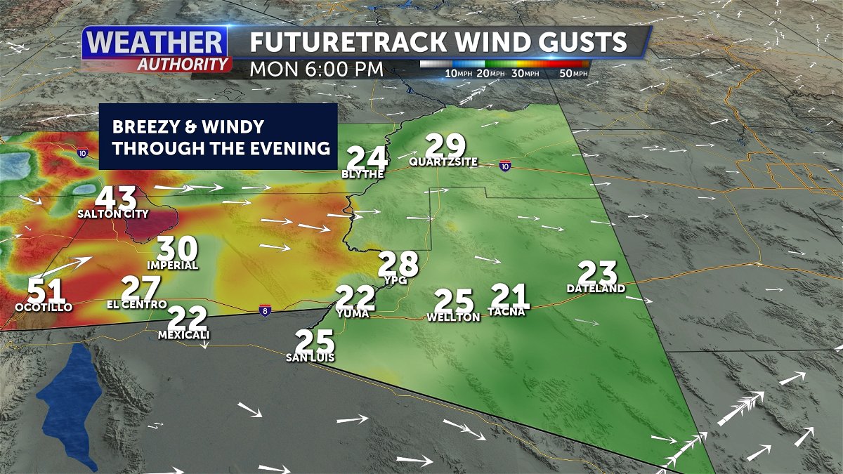
Tracking lots of sunshine and seasonable temperatures in the days ahead.
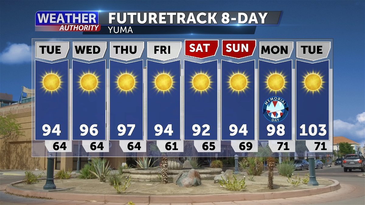
Jump to comments ↓

Melissa Zaremba
Melissa Zaremba joined KYMA in November 2021 and is the Chief Weather Forecaster.
If you have a story idea or want to share any weather pictures with Melissa, you can email her at [email protected].
KYMA KECY is committed to providing a forum for civil and constructive conversation.
Please keep your comments respectful and relevant. You can review our Community Guidelines by clicking here
If you would like to share a story idea, please submit it here .
- Share full article
Advertisement
Supported by
Deadly Clashes in a French Pacific Territory Raise Fears of Civil War
France has sent troops to quell violence in New Caledonia, where Paris is seen as backtracking on promises of self-determination.

By Pete McKenzie
A chocolate factory and a soda bottling plant set on fire. Molotov cocktails thrown at the police, and prisoners taking guards hostage. Five people dead. As protests against French control boiled over this week in New Caledonia, the South Pacific archipelago experienced some of its most intense violence since a civil war decades ago.
“I’m in a state of shock, I can’t move,” Lizzie Carboni, a writer who lives in Noumea, the capital, said by phone as the fourth night of protests began on Thursday. When she checked on her parents, Ms. Carboni said that her mother told her: “We never wanted to tell you about what happened in 1984, but it’s happening again.”
France annexed New Caledonia, which lies about 900 miles off the eastern coast of Australia, in 1853. It built a penal colony and over time shipped in more foreigners to mine New Caledonia’s vast nickel reserves . That eventually made the Indigenous Kanaks a minority in their own land.
The most serious challenge to French rule came in the 1980s, when French troops were ordered in to quell a violent uprising. Dozens of people died in the ensuing clashes. To end the fighting, French authorities agreed to put New Caledonia on a pathway to independence.
But the calculus in France has changed in recent years with the intensification of the jostling between the United States and China for influence in the Pacific. French officials fear that China could gain sway in an independent New Caledonia, just as it has sought to do in other South Pacific countries like Vanuatu and the Solomon Islands.
President Emmanuel Macron of France visited New Caledonia last July and laid out his vision for the Pacific outpost.
“New Caledonia is French because it has chosen to remain French,” Mr. Macron told a crowd of people opposed to independence. “No going back. No stuttering.”

Four decades after the civil war ended, however, pro-independence sentiment and resentment against French settlers remain strong in New Caledonia, which is now semiautonomous.
In the 1980s, France agreed to hold an independence referendum within a decade — a bet that a rising Kanak middle class would choose to remain French. As the new century dawned, voting was put off for two more decades. But the French authorities agreed to freeze electoral rolls so that recent arrivals to New Caledonia, who are thought to be more likely to support continued French rule, would not sway the vote. France also agreed to hold three referendums instead of one, a nod to the possibility of violent protests.
In the first, held in 2018, the pro-independence camp had a surprisingly strong showing, garnering 43 percent of the vote despite concerns that New Caledonia’s beleaguered nickel-dependent economy could not survive without financial assistance from France. Two years later, 47 percent voted for independence.
The third and last referendum took place after the coronavirus pandemic, which devastated many Kanak communities. Local mourning customs prohibit political activity, and Indigenous leaders urged Mr. Macron to delay the 2021 vote. When it went forward as scheduled, many Kanaks boycotted it in protest, and the vote was overwhelmingly in favor of staying with France .
Pro-independence leaders have called for holding another vote, but talks with French authorities are at an impasse. And Mr. Macron’s government has backed an amendment to the French Constitution that would allow some people who have moved to New Caledonia since 1998 to vote in the territory, calling it a move toward full democracy.
While pro-independence sentiment is longstanding in New Caledonia, the most recent string of demonstrations began on May 4 with a commemoration of the death of Jean-Marie Tjibaou, a Kanak leader who was assassinated by a disaffected nationalist after negotiating the end to the civil war. Protests spread across the 140 islands of New Caledonia, which is home to about 270,000 people.
In an interview last year, Mr. Tjibaou’s son Joël Tjibaou said that France did not understand the depth of feeling in the country.
“When you see our country, you understand why we are fighting for independence,” he said. “The white people came here, stole our land, stole our customs, don’t respect us.”
On Monday, France’s lower house of Parliament debated the constitutional amendment, which has already been passed by the Senate. As it became clear that the proposal would pass, protests in New Caledonia, especially those in Noumea, turned violent, according to Adrian Muckle, who teaches history at Victoria University of Wellington in New Zealand.
“We are in a state of civil war,” Sonia Backès, the territory’s most prominent anti-independence politician, wrote to French president Emmanuel Macron on Wednesday. “Without massive and urgent intervention from the state, we will lose control of New Caledonia in the coming hours.”
Local authorities imposed a curfew, canceled international flights and mobilized 1,700 law enforcement officers. France has since deployed the army and is flying in 1,000 more police officers. The French government has declared a state of emergency, put 10 protest leaders under house arrest, and banned the social media app TikTok in the territory.
Rioters have killed one police officer and fired on several others, according to the French authorities. Another officer was killed by accidental gunfire. At least 64 officers have been injured.
The authorities have said calm has returned to Noumea, but some residents say they are still scared to go out.
“It’s too dangerous,” Fabrice Valette, who lives in the small town of Paita, to the north of Noumea, with his partner and 1-year-old son, said on Friday. “We really don’t know how to get food or drinks or medicine.”
Many protesters appear to be teenagers and young adults who have concealed their identities with masks, three residents said in interviews. At roadblocks and on streets, many protesters are flying the multicolored flag of Kanaky — as New Caledonia is known in the Indigenous language — amid clouds of smoke from burned-out cars and buildings.
The organizer of the protests is a group called the Field Action Coordination Cell, whose leaders said that they did not condone violence. Dominique Fochi, a Paris-based leader of the group, warned that a French crackdown could backfire.
“We hope that sending additional resources there does not offer means of repression, which would only make things worse,” he said.
The constitutional amendment must now be approved by a joint session in the French Parliament, which is scheduled for June.
On Friday, Roch Wamytan, president of the New Caledonian legislature, dismissed requests by Mr. Macron for talks. He said, “How can you discuss with the president of the French Republic in these conditions?”
Nicolas Metzdorf, who represents New Caledonia in the French National Assembly, blamed pro-independence leaders for the unrest. He acknowledged there was a risk of a return to civil war.
Gerard Darmanin, the French interior minister, said on Thursday that foreign interference from Azerbaijan had played a role in the unrest. (Relations between the two countries have been strained by France’s support of Armenia in its territorial dispute with Azerbaijan.)
Mr. Darmanin did not provide specifics, and Azerbaijan has denied the allegation.
Some were worried about the escalation of violence in a country where there are a lot of firearms — about one for every four residents.
“Everyone owns guns, so it can get worse very quickly,” said Mr. Valette, the Paita resident. “I think it will be very hard to unite people and be one country after this.”
Reporting for this story was supported in part by the Pulitzer Center.
IMAGES
VIDEO
COMMENTS
Times New Roman is the standard choice for academic documents, and the thesis preparation guidelines of some universities stipulate its use. For many years, it was the default body text for Microsoft Word. With the release of Office 2007, the default became a sans serif typeface called Calibri. Lacking the little projecting bits (serifs) at the ...
Times New Roman's historical significance and widespread use. And then there's Times New Roman. The OG of academic fonts. It's got history, it's got style, and yes, it's everywhere, but that's because it works. It's like the classic blue jeans of fonts - you just can't go wrong with it. FAQ On The Best Fonts For Academic Papers
But there is another feature that many serif fonts have. Look at these three (which are all great fonts to use in your PhD thesis, btw): In order: Palatino Linotype, Cambria, and Times New Roman, all in the same size. Blow-up shows the weight contrast within the font. Green arrows demarcate heavy strokes, magenta arrows demarcate light strokes
8 Best Fonts for Thesis Writing. A thesis can look presentable if you include appropriate fonts in it. The following fonts will create a positive impression on your professor. Let's take a look: Times New Roman Times New Roman was particularly designed for Times Newspaper for London. This font has a separate and different value in a formal style.
The font should be consistent throughout the thesis. All final thesis submissions must be in 12 point, Times New Roman, black font. This includes the thesis text, preliminary pages (title page, abstract, etc.), charts, figures, graphs, tables, photograph captions and appendix text. Remember to force active HTML links to show in black and to ...
Fonts. Students should use the same font size (11- or 12-point) and style (typically Times New Roman) through the thesis, including labels and references. Tables, captions, and footnotes should use the same font style but may be smaller in size (usually 10-point).
All text material must be in the same font/typeface; all headings and figure/table titles/captions must be in a consistent typeface. Please select a font and size that is highly legible and will reproduce clearly. Ornate or decorative fonts such as script, calligraphy, gothic, italics, or specialized art fonts are not acceptable.
Fonts must be 10, 11, or 12 points in size. Superscripts and subscripts (e.g., formulas, or footnote or endnote numbers) should be no more than 2 points smaller than the font size used for the body of the text. Spacing and Indentation. Space and indent your thesis or dissertation following these guidelines:
Font type and size: Times New Roman, 12 pt, in bold . 3. Centerhe page header t on the line . 4. Use upper and lower case letters . 5. ... Title of Dissertation/Thesis . a. The title should be in Times New Roman 12pt . b. Capitalize the significant words in the title . c. Center the title; Single space the title if more than one line. ...
Generally, the same font should be used throughout the thesis (dedication page and scholarship-appropriate alterations excepted). Size. Normally the font should be equivalent to 10 to 12 point font in Times New Roman or Arial for main text, and at least 2mm high in tables and figures. Colour. Font colour should normally be black throughout ...
So far this is the formatting I used: main title "Thesis of ...": Arial 16pt. Abstract subtitle: Times New Roman 12pt. Abstract content: Times New Roman 11pt, justified. Heading 1 (main sections of the paper): Arial 14 bold. Heading 2 (sections of the paper, corresponding to Headings 1): Arial 12 bold. Content of each sections (Headings 2 ...
Times New Roman is, for better or worse, the standard font for academic manuscripts. Many teachers require it because it's a solid, legible, and universally available font. Stanley Morison designed it in 1931 for The Times newspaper of London, so it's a very efficient font and legible even at very small sizes.
A variety of fonts are permitted in APA Style papers. Font options include the following: sans serif fonts such as 11-point Calibri, 11-point Arial, or 10-point Lucida Sans Unicode; serif fonts such as 12-point Times New Roman, 11-point Georgia, or normal (10-point) Computer Modern (the default font for LaTeX); We recommend these fonts because they are legible and widely available and because ...
20. If there's no template, then the choice is yours. However, you should make sure to pick a font that's easy to read. The usual standards in academia tend to be the Times, Helvetica/Arial, and Computer Modern families. This doesn't restrict you from using fonts like Book Antiqua, Myriad Pro, Goudy Old Style, or Garamond, but they're ...
Times Roman is the most chosen font styles for thesis and dissertation writing but still, it has some common drawbacks as this font was created mostly to create spaces in between the words and letters but according to some professionals, the usage of this font causes overuse of view.
Type and font size. Recommended fonts: Times New Roman; Arial (preferably in upper case) Garamond; Size: Epigraphs, chapter titles and section titles: 14 points. ... "The thesis may be written and defended in any of the languages commonly used in scientific communication in the relevant field of knowledge. If the language of writing and defence ...
The preferred fonts are 10-point Arial or 12-point Times New Roman; however, any legible serif or sans-serif standard font may be used, as long as it is roughly equivalent in size. Script or ornamental fonts should not be used. The font should be uniform throughout the text, although a separate font or a slightly smaller size may be used for ...
APA Style papers should be written in a font that is legible and widely accessible. For example: Times New Roman (12pt.) Arial (11pt.) Calibri (11pt.) Georgia (11pt.) The same font and font size is used throughout the document, including the running head, page numbers, headings, and the reference page. Text in footnotes and figure images may be ...
3. Garamond. 4. Cambria. 5. Calibri. Every student hates the fact that professors deduct their marks in the dissertation for not choosing an appropriate font in their writing. Most of the time, students choose times new roman font for their dissertation writing. But before making any decision regarding font selection for this type of document ...
Use the standard A4 format and set the same margins all around (e.g. 2.5 cm, top/bottom, right/left). Remember that the thesis will be printed and boud and that margins should thus be large enough. Text size and line spacing. The text should be in 11 or 12 point character and 1.5 spaced lines. Footnotes should be in 10 point character and ...
TheSerif is a font family with 3 different typographic width(s). TheSerif is part of the Thesis superfamily, which Luc(as) de Groot first published in 1994. Although it was conceived to be the perfect secondary font within the Thesis system - for use in headlines, subheads, pull quotes, etc. - TheSerif has also been used successfully as a text font in its own right.
Recommended Font Size. The recommended font size in a dissertation is 10 to 12 points at max. Having larger or smaller fonts can give you a bad time in structuring your dissertation according to the pages. Margins… Are They Important? Oh yes, they are… Don't you ever think: "oh, why should I care about the spacing on the sides? Does it ...
The Thesis superfamily was first published in 1994 as part of the FontFont collection, and became part of the LucasFonts type library in 2000. The family was conceived as a versatile typographic system of ambitious scope. It grew out of a dissatisfaction with the limited range of good typefaces available for corporate identity projects.
Breezy to windy conditions will occur during the afternoon and evening hours, with the highest winds of 30-40 MPH through tonight. Winds will start to ease up after midnight with more breeziness ...
This introduction is a thesis in a thimble for the whole franchise, which combines an intriguing premise — what if apes evolved beyond men — with a host of other social and political concerns ...
Deadly Clashes in a French Pacific Territory Raise Fears of Civil War. France has sent troops to quell violence in New Caledonia, where Paris is seen as backtracking on promises of self-determination.