- Oct 27, 2021
- 13 min read

How to design an effective graphical abstract: the ultimate guide

All researchers know this story by now.
We spend months writing and revising our manuscript to absolute perfection. We feel pretty proud of our work, and we’re certain our target journal is going to roll out the red carpet and embrace it with open arms.
Alas, something unexpected happens…
We hit a massive roadblock at the tail-end of the manuscript submission process, simply because we don’t have a “graphical abstract.”
“A graphical what?!” we exclaim, throwing our arms in the air.
“What on earth IS this thing preventing us from submitting our amazing manuscript? This is going to be a massive waste of time!”

So, what’s the point you say?
You’re about to learn exactly how important graphical abstracts are, AND how to nail them right the first time!
Let’s talk about the purpose of graphical abstracts, what they should look like, and how you can easily create one to stay competitive with your research.
What on earth is a graphical abstract?
Let’s start by clarifying what a graphical abstract (GA) is NOT.
But first imagine this. . . it’s late at night.
After several hours of reformatting your paper to the guidelines, you finally hit that SUBMIT button, go to bed, and pray that your manuscript is accepted.
Then at the last minute, something really (really!) frustrating happens. Your target journal requires a “graphical abstract” to be submitted along with your paper, and you can’t move forward without one!
So, what do you do?
You have three choices:
1) Scream and damn the day you decided to become an academic (oh the memories…)

2) Design a graphical abstract from scratch (remember, it’s half-past midnight already).

3) Grab the prettiest figure from your paper and pretend it’s a graphical abstract (you know, the statistically significant graph from Figure 3.1A!)

Look, chances are you’re not a graphic designer, and creating a masterpiece with PowerPoint is out of the question. So I’m certain you’d choose Option 1 or Option 3. . . and then pay a VERY steep price for it. If your journal allows it, there may be an Option 4 for submitting a video abstract . We can compare and contrast the options later. Today we’re talking specifically about graphical abstracts.
And on that note, let’s get one thing straight: a graphical abstract should not be a copy of the best figure in your paper. N E V E R.
So if it’s now 3 am and you’re tempted to do that, go to bed! Or, keep reading.
What’s the purpose of a Graphical Abstract?
Now that we’ve clarified what a GA should not be, let’s nail down its purpose.
A graphical abstract is used to visually and concisely summarise your manuscript and its main message. It tells a clear and concise story , and how it works in your favour depends on who is reading.
If your peers are reading: A GA becomes a promotional tool that positions your paper to stand out in places like social media . As the name suggests, a GA has the same purpose as a traditional abstract. But with 7,000+ peer-reviewed articles being published daily, nobody has the time to read a 250-word abstract. GAs work like movie posters: to grab attention and drive traffic to your paper (the equivalent of the movie). What’s more, they even have the power to double the number of times your article is read . Incredible!

If a non-academic is reading: They don’t speak the scientific jargon, and the blocks of text and the boring black-and-white figures just don’t do it for them (can you blame them?). Instead with a well-designed GA, these people can finally become acquainted with, understand and appreciate, your research. A GA extends the reach of your research beyond your peers. A GA is clear and to the point, just like if you were to explain your scientific profession at a dinner party . The lay person appreciates short and sweet explanations, not a full lecture!

Do they really work?
Graphical abstracts have been shown to improve the reach of new scientific publications.
One study used Twitter to quantify the effect of including a graphical abstract in the promotion of new publications. The researchers compared Twitter posts with and without GAs over one year, using each post as its own control. They found that the reach of posts with GAs were dramatically greater than those without.
Tweets with GAs received a 7.7-fold increase in Twitter impressions , a 8.4-fold increase in retweets , and a 2.7-fold increase in article visits . We’ve even compiled this same study into a GA below, check it out!

Who will read them?
The first question you should ask yourself is, who do I want to reach with this GA? Am I just interested in reaching my small community of peers interested in my obscure science or am I interested in going beyond?
Expert audiences
There is a lot of research out there that is hyper-technical and interests only a limited number of experts. If that’s your case, great! You know who you are talking to: the big cheeses of the field.
If you feel that this is your case, I have a surprise for you. You have total freedom in the style of graphical abstract you can use. Because your audience has an expert level of understanding of the subject, you have the freedom to go technical or not. You can decide to show them complex diagrams and p -values or hook them in with a funny comic with a highly nerdy joke that maybe 8 people in the world will understand.
It is up to you.
Non-expert audiences
But what if you wanted to share your work with your next door neighbour, or your grandma?
(… assuming neither of them are scientists in your field…)
Science has traditionally been for (guess what) scientists. That’s why Open Access publishing is a super trendy topic. The idea of removing paywalls is great… for scientists. However, is this really enough to make science truly “open”? The paywall is one barrier, but what are the others? And how can a GA help?

Comprehension is the greatest barrier of all. And it’s the barrier that the general public or layman audience can’t break on their own.
Let’s help them out by using these tips on your GA.
Context: you need to provide some context because otherwise a non-expert won’t be able to appreciate the relevance of your research.

No jargon: Some people call it Jargon Monoxide because it asphyxiates audiences. It is true, not being able to understand a few words will cause the reader to switch off and think that this is just not for them.

The “so what?” factor. The reason why your research is relevant might be obvious to your peers, but it is definitely not obvious to Joe and Jane next door. Tell them in plain English why this matters to their lives.

Styles of graphical abstracts
Let’s now talk about the fun stuff! Style!
When it comes to GA’s, there isn’t a one-size-fits-all, cookie-cutter template. Scientists and artists from around the world have explored a variety of approaches and styles .
So while there are no concrete rules about what a GA should look like, we’re familiar with a number of popular styles and how each one fits a certain audience.
Let’s have a look at a few examples of some different styles and where they sit in the Experts-Public spectrum .

Style 1: The classic diagram

This is a more traditional style of GA that’s been around for a while. Using GAs like this wasn’t uncommon in the chemistry field a few decades ago, given that chemistry is such a visual topic.
You’d notice that there is no background context and it’s full of technical jargon. If the target audience is other experts then great, they’ll get it. But this is not suitable for any other kind of audience.

Style 2: The p-value aficionado

This is called a ‘Visual Abstract’. It’s very popular in the medical field, and usually consists of vertical or horizontal panels. It’s a little more accessible than the previous style, with some easily recognisable icons and some text to guide the reader. But, it’s still geared towards other scientists.

Style 3: The infographic

In the infographic style, there’s less emphasis on data and more emphasis on the main scientific message and the “so what” factor.
As the most versatile style, it provides a good middle ground on the accessibility spectrum. It starts with a sentence that provides some background context, and the images are clear and interesting. What’s important is the use of a large eye-catching graphic that draws people’s attention.

Style 4: The comic strip

Here we can play with our knowledge of pop culture, humour and artistic freedom.
A comic-style is perfect for telling your scientific story in a fun, whimsical way which can include metaphors or real-world references. This is by far the most accessible way for the public to understand the intentions behind the science, without going into the nitty-gritty detail.
The last style is a comic style and is clearly aimed at the general public. It’s visually appealing with some custom graphics, and it uses humour to convey the key scientific message: opening up the target audience to engage with everyone.

How can I design one?
Before we dive in, let’s establish one unbreakable rule.
Your GA will be CLEAR and CONCISE . Got it? Good.
What’s that? You’ve got an awesome multi-dimensional plot with 8 colours? Great!
Keep it in the paper, that’s where it belongs.
Got a beautiful table with 20 rows of significant p-values? Amazing!
Let’s keep this rule in mind as we work through the following steps.

Step 1: Planning the content
Once you’ve identified your target audience, let’s decide on the content, starting with the text.
While you do need some text to provide context and to guide the reader through the graphics, you’ll need to keep it as short as possible: definitely less than 80 words.
What to write
We’re huge advocates of the And - But - Therefore format of storytelling invented by Dr Randy Olson in his book “Connection” which one of our favourite science communication books of all time!
The ‘And’ is the context (background), the ‘But’ is the hook that holds the reader’s attention (knowledge gap), and the ‘Therefore’ is what you found (results and conclusions). You can read more about this format of storytelling here . We can leave out the methods (unless you’re writing a methods paper!). If your reader is interested, they can find them in all their nitty-gritty glory in the full paper.
Now that you have your target audience in mind, let’s decide on the content, starting with the text.
You do need some text to provide context and to guide the reader through the graphics, but keep it as short as possible. And anyway, the clearer your graphics are, the fewer words you’ll need!

How to write it
If you’re talking to experts, you might have some technical words, but if you’re engaging with the public you’ll need to stay away from all jargon. Remember that jargon monoxide is lethal!

Step 2: Concept
Crack your knuckles because now we’re getting to work on how your GA will look. On paper, or in your design software, make the first draft.
If you’re particularly arty, roughly draw the key graphics that you’ll polish up later. If not, don’t worry, just keep in mind where you want to put in the graphics, and afterwards, we’ll track down the best the internet has to offer.

Ask yourself where your GA is going to be distributed most, because this will determine its size. If you’re submitting it to a journal, you’ll need to follow their instructions. Or maybe you just want to make a splash on social media. Twitter, Instagram etc. each have their own preferred sizes, and this determines whether or not your GA will be cropped when viewed on mobile devices etc. Decide which platform will give your GA the best chance of being seen, and size it accordingly.

Most things are either read left to right, or top to bottom. The easiest way to lay things out neatly are by arranging text and figures in panels, which could be connected by an arrow or numbering system. We’ve covered this in detail for scientific posters , and luckily the same principles apply.

Negative space
No, this isn’t astronaut terminology. Negative space just means space on your GA that’s not filled with stuff. It's a resting spot for the eyes.
Step 3: Designing
This is the most important part. This is what first grabs the reader’s attention when they start scrolling through Twitter, still half-asleep, while they eat breakfast. It should be big, bold, and capable of landing a solid impression. One glance should give your topic away. So, naturally, this isn’t the place to put Figure 3.1A of your manuscript!
The reason we’re choosing your image first is because, unless you’re making your own from scratch, the image will determine which colours you can use for the rest of the GA. We’ll go into more detail in the next section.
You can outsource modifiable images legally through The Creative Commons Search Engine , and there are sites dedicated to this, including PixaBay and PNG Tree . For photos, check out Unsplash . Some sites may ask for accreditation, so make sure to follow individual guidelines.
Or maybe you’re keen on drawing everything from scratch? We’ve got handy tips for that too .
So now, what software will you use to produce your GA? We’ve previously covered our personal recommendations for free and paid illustration software , so check out what suits your skill level and/or budget!

If you’re using an image you found on the web, then this step is easy. You’re going to sample the colours from that image using the Eyedropper Tool . It exists in every design software (even Microsoft PowerPoint!). Doing this will keep a consistent palette of colours throughout your GA.
Choosing colours from scratch? It is great fun to go freestyle, but there are literally an infinite number of colours out there, so how do we choose the 3 to 5 that we need?
Simple. Search “infographic colour palette” in Google Images and find one that you like and that is appropriate to your theme.
Marine biology? Well then, you can’t go wrong with some shades of blue.
Plant ecologist? How about a couple of greens and a nice brown?
Once you’ve found a colour combination that you like, use the Eyedropper tool to sample them, and hey presto, you’ve got your palette.
Pro tip 1: You can even install an eyedropper tool on your web browser. ColorZilla is a good one for Google Chrome.
Pro tip 2: Adobe Colour Wheel is a nice way of getting complementary colours based on colour theory - don’t worry, it’s easy to use.
OK, background, we want something eye-catching, so that means a photo, right? Nope! A texture? Double nope. Anything too busy will make your text and graphics hard to read.
A solid colour is perfect . We can be a bit more adventurous than white, but let’s not get carried away: save the hot pink for your underwear drawer.
Have you ever stared at a blank Microsoft Word page for over an hour, just because you were busy choosing a font?
Good. Because font choice is incredibly important!
We’ve covered fonts in detail before , but in a nutshell, this is what you’ll need to consider:
You’ll need a font without serif, that is sans serif.

Not only does sans serif sound cool (hey, look at you speaking French), these fonts are easier to read and appear more modern. So it’s goodbye Mr. Times New Roman , hello Mrs. Arial .
Wait. Comic Sans is sans serif , does that mean you can use it? N O P E. Just don’t! Every time a scientist uses Comic Sans a graphic designer dies
What about font size? Well, it depends on how large you make your GA in your software. Here’s a guide. Make your GA full-screen on your computer monitor. Can you read the text from a metre or two back? If so, then your text is probably big enough.
Do you need a title? Not necessarily. You might not have enough space. But, if you think it’ll help your GA to be CLEAR and CONCISE, go for it. You have my blessing.
Key information
If your GA is shared and used by other people, then you want your audience to be able to find your work. Include the title of your paper, the names of the authors, the year of publication, the journal, the DOI, and maybe even a QR code !

If you are a Microsoft aficionado, you can use PowerPoint to make your GA - just be aware that it has its limits. If you fancy your design skills and have time to invest in the steep learning curve, use Affinity Designer, Adobe Illustrator or Indesign. But if you want something more user-friendly (and free!) then check out Canva .
Step 4: Getting ready to release your GA into the wild
Congratulations on putting together your masterpiece. This is new territory, so you should be proud. But what’s next?

Take a break and come back to your GA with fresh eyes. Note what your eyes are drawn to first. Is this the first thing you want your audience to see? If so, then you’ve planned your GA well.
Do the elements of your GA align well? Good alignment will give your GA a professional look, and it’ll keep my Obsessive-Compulsive Disorder under control too, so thanks.
Get some feedback
Different people interpret images, symbols and icons differently. So something you think is obvious might not be to others. Remember the first part of our unbreakable rule? ‘CLEAR’.
Get feedback from people within your target audience. Your friends, if you’re targeting the public, and your colleagues if you’re targeting other academics. Even if this is the case, your friends are a good tool here too. If they can understand it, then you’ve done your job well.
Colour profile
If you designed your poster with professional software, you’ll have the ability to control the colour profile. Nothing complicated, there are two options: RGB and CMYK. The first one is for digital use, and the second one is for printing — pick the first one. That’s all you need to know.
Saving the file
Always keep your source file, in case you need to edit it later. But save your output as a .PNG (this is best for screens). If this isn’t available a .JPEG is good too.
Posting to social media
When posting on social media don’t forget to include the URL link pointing to the article’s page. This will not only help drive traffic to your paper but will also make your social media post visible by the Altmetric algorithm. If you don’t know what Altmetric is…let us fill you in, check out our awesome infographic.
Include any relevant hashtags in your post, and tag your co-authors. You should mention the journal, your institute and funding bodies too. This is not only good practice but could lead to a powerful re-tweet by an account with a large following. Garnish your post with some emojis and serve.

And that's the whole recipe!
Main take-aways
A graphical abstract is a visual summary of your work. Not a recycled Figure 3.1A!
Plan your design around your desired target audience.
Less is more! Recite after me. Your GA will be CLEAR and CONCISE.
Haven’t got the time to make one yourself?
No worries, we’re here to help!
At Animate Your Science we help researchers from all around the world stand out and have an impact. And an eye-catching, show-stopping graphical abstract is exactly what you’ll need to get started!
Our team of science communicators and designers can turn your research into an infographic or animation that will turn heads. Check out our gallery to find a style that suits you!
Explore how we can help you to unleash your impact by contacting us today !
Dr Juan Miguel Balbin
Dr Tullio Rossi

#graphicalabstract #Twitter #infographic
Related Posts
Tell Them a Story: How to Avoid the Standard Boring Presentation
Best examples of graphical abstracts
What’s better: graphical abstracts or video abstracts?

Loading metrics
Open Access
Perspective
Ten simple rules for designing graphical abstracts
Roles Conceptualization, Funding acquisition, Project administration, Visualization, Writing – original draft, Writing – review & editing
* E-mail: [email protected] (HKJ); Martin.bornhä[email protected] (MB)
Current address: Centre for Data Analysis, Visualisation and Simulation, University of Applied Sciences of the Grisons, Chur, Switzerland
Affiliation National Center for Tumor Diseases—University Cancer Center (NCT-UCC), Universitätsklinikum Carl Gustav Carus an der Technischen Universität Dresden, Germany
Roles Funding acquisition, Visualization, Writing – review & editing
Affiliations National Center for Tumor Diseases—University Cancer Center (NCT-UCC), Universitätsklinikum Carl Gustav Carus an der Technischen Universität Dresden, Germany, Medical Clinic 1, Universitätsklinikum Carl Gustav Carus an der Technischen Universität Dresden, Germany
- Helena Klara Jambor,
- Martin Bornhäuser
Published: February 1, 2024
- https://doi.org/10.1371/journal.pcbi.1011789
- Reader Comments
Citation: Jambor HK, Bornhäuser M (2024) Ten simple rules for designing graphical abstracts. PLoS Comput Biol 20(2): e1011789. https://doi.org/10.1371/journal.pcbi.1011789
Editor: Scott Markel, Dassault Systemes BIOVIA, UNITED STATES
Copyright: © 2024 Jambor, Bornhäuser. This is an open access article distributed under the terms of the Creative Commons Attribution License , which permits unrestricted use, distribution, and reproduction in any medium, provided the original author and source are credited.
Funding: HKJ received a salary from an habilitation award of the Medical Faculty of the Technische Universität Dresden. HKJ and MB received project funding from the Hochschulstiftung Medizin Dresden. MB received funding from the MSNZ program of the Deutsche Krebshilfe. The funders had no role in study design, data collection and analysis, decision to publish, or preparation of the manuscript.
Competing interests: The authors have declared that no competing interests exist.
Introduction
Explanatory graphics that summarize knowledge are common in science communication. These graphics integrate new insights with the existing body of knowledge in a particular field of research. Explanatory graphics have been widely used in chemistry for many years to depict structures [ 1 ], and they have now gained popularity across various scientific disciplines as graphical abstracts [ 2 ]. Scientific journals are increasingly asking authors to provide graphical abstracts along with a paper to attract audiences online and on social media. These graphical abstracts are prominently displayed on the journals websites, embellishing the table of contents, and serving as a visual pendant to the written abstract. Due to this usage, graphical abstracts are also referred to as “TOC” image or “thumbnail views.”
Graphical abstracts are not intended to provide a complete understanding of a research article, even though they are often presented online with just the title of the work. A study confirmed graphical abstracts by themselves are insufficient to comprehend the key message of a paper [ 3 ]. Instead these visuals serve to attract attention and are meant to be read in conjunction with the written abstract. According to Cell press guidelines, graphical abstracts should inspire audiences to browse, stimulate their interdisciplinary curiosity, and allow them to rapidly screen for papers in journals [ 4 ]. As graphical abstracts are a relatively recent addition to the publishing landscape, quantitative data on their usage and usefulness are still limited. However, early analyses indicate that while graphical abstracts do not necessarily increase full-text reads or citations, they do enhance the abstract views [ 5 ] and boost altimetric attention scores of articles [ 6 ].
Like other explanatory visualizations, graphical abstracts have common features such as a central visual element, often icons, diagrams or photos, explanatory text, and use clear layout and color schemes to increase readability. These elements are often structured using arrows and lines and enhanced with color. The design elements of graphical abstracts were recently quantified in a research study that classified graphical abstracts based on their overall organization [ 2 ]. In their work, Hullman and Bach revealed the diversity of graphical abstracts in the current literature, and in particular, the many possibilities to use layout for readability. They also pinpointed common problems associated with graphical abstracts, such as inconsistent visual styles, unclear relationships between pictures, and missing annotations. These challenges were also identified in a complementary qualitative study of graphical abstracts [ 7 ].
Training of scientists, especially early career researchers, in the art of crafting comprehensible and attractive graphical abstract has been somewhat lagging. A brief guide for graphical abstract design is available for medical writers [ 7 ] and for creating overview figures [ 8 ]. However, most scientist are not trained in data visualizations or visual communication [ 9 , 10 ], and even less so in creating explanatory visuals of their research. It’s important to note that visual design is a nontrivial endeavor. Publishing houses, journals, and major research institutes often employ visual teams to create attractive explanatory figures for scientific data.
Here, we present 10 simple rules for designing graphical abstracts. The 10 rules are informed by our experience teaching biologists, clinicians, students, and established scientists, and from jointly preparing graphical abstracts for publications and grants ( Fig 1 ). The article discusses all aspects of graphical abstract preparation, from foundational decisions about the message and the key visuals (1 to 3), to designing the layout (4 to 6), and complementing the design with text (7) and color (8). We also provide an overview of tools and software commonly used for making graphical abstracts (9) and highlight the benefit of feedback in the process (10). The order of the 10 rules reflects our “design pipeline” from starting with a draft to implementing the draft electronically; however, as with all creative processes, you are encouraged to adapt the process to your own style.
- PPT PowerPoint slide
- PNG larger image
- TIFF original image
The evolution of a graphical abstract, from sketch (A) to a rapid Biorender draft (B) and final implementation in a graphical software program (C). All drawings by HKJ, licensed under CC0, https://doi.org/10.6084/m9.figshare.24486061.v1 .
https://doi.org/10.1371/journal.pcbi.1011789.g001
Rule 1: Key message for audience
Before embarking on the design of a graphical abstract, it is essential to know your message. This tip is not specific to graphical abstracts, but also essential for producing an understandable and clear visualization. The process of defining a key message varies. Some start with doodling on a post-it, some with key visuals, and some by iteratively shortening the abstract to 1 or 2 punchy sentences. Ideally already at this stage co-authors are involved and provide feedback (see #10). Recent tools, such as chatGPT, may be helpful in facilitating a dynamic exchange and the concise distillation of the core message. Whichever route is yours, without a clear central message, it will be impossible to design a clear graphical abstract and reach the goal of visually summarizing your research paper.
Rule 2: Pictures and pictograms
The key components of every graphical abstract are the visual elements. Most often, graphical abstracts include pictograms or symbols and, less commonly, iconic microscope ( Fig 1 ) or photographic images, or data (see #5). Pictograms may also be hand-drawn, but mostly biologists use simple shapes, circles, ellipses, and rectangles, when creating pictograms from scratch. In recent years, numerous icon collections have become available, many of which are free to re-use and do not always need attribution. In most icon repositories pictograms can be downloaded as PNG (Portable Network Graphic), a raster-graphics format for lossless data compression. PNGs are ready to use in graphic software but not adaptable. Alternatively, icons are provided as SVG (Scalable Vector Graphics), an image format that can also be used interactively on the web and is fully adaptable in appearance with graphic software.
For general icons, many repositories exist for simple icons:
- PowerPoint offers inbuild image and icon libraries and many pre-drawn shapes that are free to use.
- Fontawesome ( https://fontawesome.com ) is a Unicode-based icon library that can be installed locally as a font for graphic programs, downloaded as full icon library, or downloaded as individual SVG images.
- Nounproject ( https://thenounproject.com ) is a large repository sourcing icons from various designers. Hence, the available icons are vast, but also not matched in style. These icons can be used for free with attribution as SVG or PNG.
- SVGrepo ( https://www.svgrepo.com ) is the largest SVG icon library, which additionally provides search functions for icon style and appearances such as color, rounded or sharp icons.
Biology and Medicine require specific icons which are available in the following repositories:
- Phylopic ( https://www.phylopic.org/ ) offers shapes of numerous animals, plants, and further model organisms, e.g., for phylogenetic trees.
- The EBI ( https://www.ebi.ac.uk/style-lab/general/fonts/v1.3/ ) provides some general scientific icons.
- Reactome ( https://reactome.org/icon-lib ) provides scientific pictograms and chemical drawings for free re-use and encourages the upload of user-designed pictograms for sharing with the scientific community.
- Smart ( https://smart.servier.com/ ) is a free collection of medical drawings from Servier Medical Art and can be downloaded as a full slide-deck and used with attribution.
- Bioicons ( https://bioicons.com/ ) is an expanding set of biology and laboratory icons from Petri dishes to model organisms available under free licenses (CC0). Initially by Servier, the drawings are expanded with user provided samples.
- Health Icons ( https://healthicons.org/ ) is a global volunteer effort to create common icons for many specialized medical scenarios available under creative commons license (CC0).
In a graphical abstract, all icons should have a similar overall appearance, meaning the same line-width, color scheme, and level of detail. Icons from the same source and/or the same designer usually have such a similar look. Fig 2A and 2B shows 2 versions of a graphical abstract with a poor and improved icon combination. If icons from several sources are combined, you could match their style by adapting the SVG-pictograms in graphic software.
(A) All pictograms used have similar overall appearance (color, size, design, modified from [ 11 ]). (B) Poor combination of pictogram for the same workflow: pictograms have different overall appearance. Icons in A: Fontawesome, Fonticons, Inc. Icons in B: Microscope: Bioicons DBCLS https://togotv.dbcls.jp/en/pics.html is licensed under CC-BY 4.0; Laptop: Icon by Simon Dürr https://twitter.com/simonduerr is licensed under CC0 https://creativecommons.org/publicdomain/zero/1.0/ ; Image/slider: see A; Colors and people: drawn by HKJ; Newspaper: https://www.svgrepo.com/svg/301104/newspaper-news , CC0.
https://doi.org/10.1371/journal.pcbi.1011789.g002
For inspiration, you may wish to explore one of the earliest icon libraries, the ISOTYPE. The ISOTYPE system was developed by Otto Neurath in the 1920ies in Vienna as a visual communication tool for low-literate populations. The designs are from Gerd Arntz and were later continued by Marie Neurath ( http://gerdarntz.org/isotype.html ).
Rule 3: Data and charts as key visual
At times pictograms cannot sufficiently represent a key message. You then may wish to include data or charts in your graphical abstracts. When your data are medical, microscopy, or photo images they may be self-explanatory in graphical abstracts. When you want to instead include data plots, you should aim for chart types that are understandable even in the short view time of graphical abstracts. Most of us are familiar with bar charts, which are the most common chart type in scientific publications [ 12 , 13 ], and with pie and line charts, plot types we usually learn in school ( Fig 3 ). These charts employ core principles of visual perception: in bar charts we almost intuitively compare lengths, in pie charts the slice areas, and in line charts we look for up- or downward trends [ 14 ].
Note that the core message (increases, is most, one third…) is communicated without axis details, labels, and legends.
https://doi.org/10.1371/journal.pcbi.1011789.g003
When it is necessary to signify the use of a specific method in graphical abstracts, sometimes method-specific charts are employed as visual placeholders. For example, t-SNE plots may represent single-cell data, red/green heatmaps can denote microarray data, and circoid plots are indicative of genomic approaches. However, it’s important to note that readers of your graphical abstract are unlikely to delve into the details in these advanced graphics. In such instances, a simple version of that charts should be used, featuring only a handful of data points or categories. Details like tick marks, axis label, and legends can be omitted. For a comprehensive understanding of different chart types and their appropriate use a valuable resources is the Data Visualization Catalogue ( https://datavizcatalogue.com/ ).
Rule 4: Layout: The dimensions
Layout describes the organization of visual elements on the page ( Fig 4 ). First, consider the space that you have available to fill. A graphical abstract for a journal website is typically shown as a square and rarely in rectangle format ( Fig 4A ). On many websites and applications, the graphical abstract has a final size not much larger than a postage stamp. When a graphical abstract is the first figure of an article, poster, or grant application, you may also opt for a landscape rectangle format. Whenever choosing a layout, you should consider how to fill the area best. In grant applications space is very limited, filling the entire width of a line may then be a best choice to not waste precious space ( Fig 4B ).
Different dimensions (A) and how they merge with text on a page (B).
https://doi.org/10.1371/journal.pcbi.1011789.g004
Rule 5: Layout: Reading direction
The layout should provide a clear entry point into your graphical abstract. Typically, we read from left to right, and top to bottom in either columns or rows. You should therefore arrange all elements of the graphical abstract along your chosen reading direction [ 15 ].
For depiction of linear processes that have a clear beginning and end, an organization from left to right is most suitable: time is usually shown as the independent variable on the x-axis in graphs. Linear processes are workflows, experimental pipelines, embryonic development, cellular differentiation, or disease progression. Alternatively, you can consider a circular layout for cyclic events such as daily or annual events, metabolic cycles, or processes like cell division. For static observations, e.g., contrasting 2 scenarios or providing 2 levels of details for 1 scenario, you could consider 2 parallel or nested organization [ 2 ]. Fig 5 summarizes the most common organizational layouts of graphical abstracts.
https://doi.org/10.1371/journal.pcbi.1011789.g005
Rule 6: Connecting the elements: Arrows and arrangement
Arrows are a key element for all explanatory graphs and visual abstracts. With arrows, we connect text, pictograms, images, and charts into a sequential narrative or “storyline” and consequently they are the most common graphical element in explanatory life science figures [ 16 ]. Arrows can reinforce your chosen reading direction but arrows can also signal any exception from this reading direction. A clear layout supported by arrows helps to quickly orient your audiences in a visualization.
In graphical abstracts, arrows have several distinct appearances and also distinct functions. Arrows also include arrowheads, lines with rounded tips or other end-marks ( Fig 6A ), and lines without any marks [ 17 ]. Remarkably, a single arrow type may convey distinct semantic meanings: an upward arrow may signify an upward movement, an increase, or a positive connotation, while a circular arrow can symbolize various temporal scales, from a day, to year, or an entire life cycle [ 17 ]. In many academic domains, arrows have also specialized applications, such as a corner/bent arrow that in molecular genetics illustrates transcription start sites [ 16 ]. Arrows can also depict various movements, representing phenomena like the passage of a molecule through a membrane, the migration of cells within a tissue, or the collective herd movement of animals. And finally, arrows and lines are also commonly used for labeling and directing attention to specific structures or regions of interest.
Common arrow types (A) and arrows in context (B).
https://doi.org/10.1371/journal.pcbi.1011789.g006
It is crucial that you clearly communicate the purpose of your arrows to your audience. When combining 2 different arrow types in a single graphical abstract, you should ensure they are visually distinct and explained. Moreover, the context in which an arrow is presented has substantial influence on how it’s perceived ( Fig 6B ).
Even with a clear layout and arrows, graphical abstracts can appear overwhelming. This feeling is rooted in the limitations of our visual system. Miller postulated the “Magical number 7,” suggesting that human sensory perception can effectively process only about 7 elements (plus or minus 2) at a time [ 18 ]. Of course, graphical abstracts typically comprise more than 7 elements. To address this challenge, design principles, often referred to as “Gestalt principles,” come into play, aiding in the organization of elements into interconnected units, or “chunks,” which enhances the information conveyed and reduces cognitive load [ 19 ].
Some of the design principles are especially helpful for graphical abstract design. “Proximity” suggests that elements can be grouped by minimizing their physical distance on the page. “Similarity” describes that elements form groups when they share common visual attributes. Such visual attributes, e.g., a shared color, pattern, or shape [ 20 ], may even lead to grouping when elements are not in close physical proximity. Grouping by similar appearance is helpful, e.g., in scatterplots, but can cause confusion if applied erroneously to non-grouped elements (see #8). “Closure” stipulates that elements within the same boundary are grouped, which explains the frequent use of boxes in design templates. However, it’s worth noting that boxes can often be replaced with white space to achieve a similar effect. The principle of “continuity” asserts that elements arranged along an invisible axis visually form a group, an idea that inspired Tufte to experiment with omitting x-axes in bar plots altogether [ 21 ]. And last, “similarity” suggests that elements arranged symmetrically appear grouped. These design principles are helpful for graphical abstracts but also valuable for improving your further designs such as scientific figures, as exemplified by Bang Wong [ 22 , 23 ].
Rule 7: Text
The most effective way to ensure audiences comprehend complex insights with graphical abstracts is by seamlessly integrating text and visuals [ 24 , 25 ]. To captivate your audience, consider incorporating well-known keywords and phrases [ 7 ]. Text can also serve as a substitution when suitable images or pictograms are unavailable, particularly for specialized names or terminology, e.g., “acetylcholine.” Text is also important for labeling ambiguous or unusual visuals, icons, or arrows. For example, a circle you use could represent a molecule, an area, or a cell. While text offers additional clarifications, be sure to keep your titles and annotations concise, devoid of jargon, and limited to common abbreviations, all of which in general enhance readability and citations of scientific articles in general [ 26 ]. Lastly, text can play a dual role as a legend when the annotation mirrors the encoding style of associated visual elements. You may color a key word in the title in the same hue as the associated data in the abstract (see Fig 3 ).
Rule 8: Colors
A key function of appealing colors in graphical abstracts is to engage your audience. Beyond that colors have further roles, color highlights, contrasts, encodes quantities, or represents the natural appearance of the depicted objects ( Fig 7A–7C ). When colors encode quantitative information, sequential or continuous data should be encoded with varying saturations of a single color, diverging data with e.g., two-color scheme, and for qualitative data you may vary the hue [ 27 , 28 ].
Color can highlight (A), encode numbers (B), or show natural appearance (C) in graphical abstracts. Be careful with your color choice when using a colored background. Image: Albrecht Dürer, Public domain, via Wikimedia Commons ( https://commons.wikimedia.org/wiki/File:Albrecht_D%C3%BCrer_-_Hare,_1502_-_Google_Art_Project.jpg ).
https://doi.org/10.1371/journal.pcbi.1011789.g007
Several tools are available that may be helpful when selecting your color schemes. Colorbrewer by Cynthia Brewer ( https://colorbrewer2.org/ ) is useful for choosing colors to encode numerical data, while Paletton ( https://paletton.com/ ) enables the selection of attractive color combinations using a color wheel. These tools can assist in achieving harmonious appearances through adjacent colors or creating striking contrasts by employing complementary colors.
Consistency in color usage is important (see #6, principle of similarity). It is vital that you maintain the same color code and scheme within the abstract, and between the abstract and the main manuscript. A change in color is not merely a shift in aesthetics, it signifies a change in meaning. Colors, being instantly perceptible, should be used sparingly to prevent overwhelming the audiences and diverting their attention from the primary message. Hence, make your color choices with utmost care.
When selecting colors, you should ensure that they are accessible to your color blind audiences [ 29 ]. But more generally, you should consider possible limitations to visually impaired audiences. A comprehensive study provides an overview of accessibility in visualizations for different target groups (i.e., color-blind, visually impaired, and blind individuals) and various visual tasks [ 30 ]. A few steps help to improve accessibility: all figures, including graphical abstracts, must always be described with accompanying text. You may also be able to provide Alt-text descriptions for screen reader software. Additionally, also visually able audiences differ in their perception of color and contrast and therefore color should be avoided as the sole channel for key information (see also #7, labeling visuals). Beyond avoiding certain color combinations, like red-green for individuals with Deuteranopia, also low-contrast color combinations and many background colors may reduce visibility and thus accessibility. You can use numerous web-based tools (e.g., https://www.color-blindness.com/coblis-color-blindness-simulator/ ) or render your monitor display settings to assess legibility. WebAIM suggests a minimum contrast ratio of 4.5 to 1 for foreground and background colors and provides a tool for assessing color combinations ( https://webaim.org/resources/contrastchecker/ ). Finally, maintaining a sufficiently high resolution is vital for ensuring accessibility, allowing your audiences to print or zoom in to your visualizations as needed.
Rule 9: Tools for graphical abstracts
Graphical abstracts are typically prepared with the same software as posters and figures. Suitable are commercial (e.g., Adobe Illustrator, CorelDraw, Affinity Designer) or open-source (e.g., Inkscape) vector-design software. Vector-based graphics programs are particularly useful as they allow for zooming in and out of visualizations without quality loss. For most graphical abstracts PowerPoint will also produce sufficient results, especially when the canvas size is adjusted and slides are exported as vector graphics such as PDF. When saving your graphical abstract make sure that your images are not compressed to prevent pixelation artifacts.
A comprehensive article reviews many common software used for illustrations as well as their advantages, disadvantages and pricing is available [ 31 ]. If you wish to use the free vector graphic software Inkscape, you may consult a practical guide for biologists [ 32 ]. Inkscape is rapidly developing and now allows direct import of icons from icon libraries, as well as processing of images and data with scripts inside the software. The proprietary alternative to Inkscape is Adobe Illustrator, which is widely adopted by scientists and for which tutorials are available [ 33 ]. Another commercial software is CorelDraw which can, like Inkscape, incorporate icons from many web-based icon libraries.
In recent years, several web-based drawing softwares have become available, such as Canva or Figma. BioRender is a proprietary web-based software powered by a large biomedical icon library, which is an attractive feature to its users; however, their appearance, shape, color, and detail cannot be changed. A drawback to many labs is also BioRender’s continuous adaptation of licenses, while an advantage is its interface with public databases, such as the Protein Data Bank. Another web-based tool is Mindthegraph, which also offers in addition design consulting. A summary of tools is available [ 7 ].
Pictograms and icons can be imported in all programs, including the web-based tools, as SVG or PNG (see #2) and Inkscape even allows the direct, web-based import from icon libraries such as Bioicons or Reactome.
Rule 10: Before, during, after: Feedback
Visual design is a dynamic and iterative process. Consequently, graphical abstracts should undergo several rounds of assessment and adjustment to avoid common pitfalls such as unclear reading directions [ 2 ] and inconsistencies in elements and style within the visualization.
Feedback can be actively sought and integrated at various stages: during the formulating of your key message, the drafting of your prototype, or the final polishing phase. As a best practice, the book Storytelling With Data in fact recommends allocating dedicated time for discussing the visualizations in every meeting [ 34 ]. As in every design of a human–computer interaction, also for graphical abstracts you may seek expert feedback, e.g., from a scientists or designers that regularly prepare graphical abstracts, as well as user feedback, e.g., from scientists or students who may read your paper.
General feedback principles [ 35 ] also apply to visual work. This means that feedback should be specific, tangible, and task-oriented and those seeking feedback should be clear in their request. In graphical abstracts, the audience must decode the visual representations. You can get feedback by observing how an expert or user is interacting with your graphical abstract, or by asking for their opinions. Ask what they see at first glance to see if the visual weight aligns with the key message. Ask about clarity of the layout and reading direction, including the meaning of arrows, and the comprehensibility of visual elements and colors. Alli Torban from Tableau, a visual design company, imparts additional guidance on the intricacies of soliciting and receiving feedback for visual designs [ 36 ].
When designing graphical abstracts in a team, we usually exchange rapid drafts or sketches of the graphical abstract several times before a solid idea emerges ( Fig 1 ) and is then prepared for publication [ 37 ]. In our experience, the process of preparing a graphical abstract also serves as a valuable exercise to assess whether our key message is succinct. It also aids writing teams and grant writers in aligning toward a shared vision or objective. The graphical abstract thus serves as a valuable tool for bridging communication or knowledge gaps in transdisciplinary teams such as consortia of clinicians, engineers, and biologists.
While initially graphical abstracts may seem like extra work for little reward, we hope that our 10 rules encourage you to start creating understandable and gorgeous graphical abstracts. A useful resource for educators wishing to teach graphical abstract preparation in a classroom setting is available from Agrawal and Ulrich, who provide templates for exercises and downloadable sample materials [ 9 ]. A quick guide, along with a PowerPoint template, is also available from Elsevier [ 38 ]. And for inspiration the British Medical Journal hosts a collection of infographics ( https://www.bmj.com/infographics ). Once you become familiar with the format of graphical abstracts, you may also wish to experiment with styles and forms. Usually, journals do not limit their authors: we have seen artistic, comic-style [ 39 ], and even hand-drawn (Fabio di Belvis: https://www.sciencedirect.com/science/article/pii/S0378517319307975?via%3Dihub ) graphical abstracts.
Acknowledgments
HKJ would like to acknowledge James P. Saenz for feedback on the draft version.
- 1. Lane S, Karatsolis A, Bui L. Graphical abstracts: a taxonomy and critique of an emerging genre. In: Proceedings of the 33rd Annual International Conference on the Design of Communication [Internet]. New York, NY, USA: Association for Computing Machinery; 2015 [cited 2023 Jun 4]. p. 1–9. (SIGDOC ‘15). https://doi.org/10.1145/2775441.2775465
- 2. Hullman J, Bach B. Picturing Science: Design Patterns in Graphical Abstracts. In: Chapman P, Stapleton G, Moktefi A, Perez-Kriz S, Bellucci F, editors. Diagrammatic Representation and Inference. Cham: Springer International Publishing; 2018. p. 183–200. (Lecture Notes in Computer Science).
- View Article
- PubMed/NCBI
- Google Scholar
- 4. Cell Press Graphical Abstract Guidelines. Cell Press [Internet]. Available from: https://www.cell.com/pb/assets/raw/shared/figureguidelines/GA_guide-1537202744020.pdf .
- 21. Tufte ER. The Visual Display of Quantitative Information [Internet]. Cheshire, Connecticut: Graphics Press; 2011 [cited 2023 Oct 23]. Available from: https://www.edwardtufte.com/tufte/books_vdqi?msclkid=d049a142816d107459dec4741f4dfaa5 .
- 34. Nussbaumer Knaflic C. Storytelling with Data: A Data Visualization Guide for Business Professionals. Wiley; 2015.
- 38. Graphical Abstract Template [Internet]. Available from: https://www.elsevier.com/journals/cellular-and-molecular-gastroenterology-and-hepatology/2352-345x/graphical-abstracts .
✨ Enrol by 15 May to get access to our Jumpstart Your Summer Writing events at no additional cost! 💰 ✨

How to Make a Graphical Abstract for Your Scientific Paper

More and more journals are requiring a graphical abstract when you are submitting your scientific paper. But what is a graphical abstract and how to make a graphical abstract for your scientific paper? In this blog post, multimedia science communicator Dr Gaius Augustus shows you three graphical abstract examples with different graphical abstract designs and answers the most common questions researchers have about graphical abstracts.
Your experiments are finished, your figures created, you’ve even written up a nice manuscript to submit to your target journal. You take a moment to pull up the formatting guidelines from the journal website. Everything seems to be in place – except for that one nagging requirement: a graphical abstract. Let me show you how you can get the most out of your graphical abstract!
WHAT IS A GRAPHICAL ABSTRACT?
A graphical abstract or graphical summary in its pure form is a visual representation of the abstract of a scientific paper. I typically see graphical abstracts in two places: social media and journal websites. While journals usually have some guidelines on the length and format of abstracts, there are often no strict guidelines for graphical abstracts.
There are several schools of thought on what information one should put in a graphical abstract. Some suggest including everything that is part of the written abstract , such as background information, the problem the study is solving, as well as the results, conclusions and implications of the study, and perhaps even the methods that were used. However, graphical abstracts don’t come up in search engines for the scientific literature, such as PubMed or Google Scholar. So, one cannot expect them to take the place of a written abstract. Instead, I tend to think of a graphical abstract as a visualisation that gets across the main idea of your paper.
Instead of including information about experiments you performed or results you obtained, I believe your graphical summary should complement your written abstract. It should give readers a quick overview of how the results fit together into a conceptual or empirical framework, and how that framework impacts your scientific field. Ideally, a graphical abstract provides some background on the research question and gaps in the literature. I recommend you to only mention the methodology if it’s crucial to understand the results. It is best to choose one main graphic that is either the most compelling piece of data or a model that integrates the data into one figure.
HOW TO MAKE A GRAPHICAL ABSTRACT?
There are graphical abstract designs that are most effective for communicating research:
- Flow diagrams
- Visual systems models
- Visual representations of the proposed model (such as a cartoon)
Let’s take this abstract as an example:
Luke Skywalker, a young orphan living with his uncle on Tatooine, is recruited into the Resistance by Obi Wan Kenobi, the last living Jedi master who has been in hiding from the evil Empire on the remote planet. Luke is informed that his father was a powerful Jedi and is given his father’s lightsaber. It is unknown whether Luke is a Jedi too and whether he can harness the power of the Force. Here, we show that Luke Skywalker is a Jedi who can harness the power of the Force. Through providing training by Obi Wan and challenging Luke through simulated and real battle experiences, we found that in the absence of visual senses, Luke was able to predict the path of incoming lasers and to accurately target a missile. Our findings support a model that exposure and motivation can activate the latent Jedi in the presence of training and challenges but can be hampered by temptation and anger. Overall, this study provides a theoretical framework for the development and activation of a latent Jedi, potentially impacting the ability of the Resistance to challenge the Empire.
How does this translate into the different graphical abstract designs? Let’s consider the first of our graphical abstract examples, a flow diagram of the above abstract:

It uses simple shapes such as squares, arrows, and crosses to describe the process. This graphical abstract is rather text-heavy, but the flow diagram gives a decent indication of the methods used, their results, and the impact of the experimental variable.

Want the process of writing a scientific paper feel more streamlined (beyond the graphical abstract)? Ready to feel more confident in your writing skills so you can share your work with a broader scientific audience?
You are in the right place. Join me in this free 1-hour long training session and have me walk you through my step-by-step paper writing system. Click the orange button to watch now or register to watch later.
The next one of our graphical abstract examples is a visual systems model . It is based on the idea of “what makes a Jedi” and divides it into the factors that activate (green, arrows) or inhibit (red, “T’s”) becoming a Jedi. Notice how this graphical abstract doesn’t include the exact experiments performed and instead focuses on the big picture:

On to the last one of our graphical abstract examples, the visual representation. A cartoon model can bring your particular study into the context of the full model:

Here we see visual representations of the specific experiments and variables of our study while using the language of a more general model. This graphical abstract design also allows you to add personality to your graphical summary.
So, now you got three graphical abstract examples: the flow diagram, the visual system model and the visual representation. But these are not the only graphical abstract designs! Your perfect graphical abstract will be dictated by both your field and your imagination. I want to encourage you to think outside of the box. Find ways to visualise your research topic in your graphical summary that are clear and concise, and support the written abstract.
HOW TO MAKE A GRAPHICAL ABSTRACT – COMMON MISTAKES
Before you now get started on your graphical abstract, I want to warn you about the five most common mistakes I see around:
- Being too vague. This applies to all parts of your graphical summary, e.g. what you did, how your results fit into the model, and why your study is impactful
- Using images flippantly. Every graphic should have a purpose, and a reader should get a general idea of what your scientific article is about from looking at the graphical abstract
- Using too much or not enough colour. Colour is important as a way of highlighting concepts and flow. It’s useful for organisation as well. But don’t overdo it. Make sure you are using colour with intention in your graphical abstract.
- Too much text. If your graphical abstract has as much text as your written abstract, it’s probably overcrowded.
- Not enough white space. White space is the “breathing room” around any piece of text or image, and it’s incredibly important in order for readers to grasp the content of your graphical abstract quickly. Give every element in your graphical summary space and ignore that itch to fill every pixel with something useful.
COMMON QUESTIONS ABOUT GRAPHICAL ABSTRACT DESIGNS
We now tackled the questions “What is a graphical abstract?”, “How to make a graphical abstract?” and I showed you three graphical abstract examples. But you may have some more questions about making a good graphical abstract design. Here are the answers to questions about graphical abstracts I get all the time:
WHAT PROGRAM SHOULD I USE TO MAKE MY GRAPHICAL ABSTRACT?
You can use any program you want to make your graphical abstract. You can draw with ink/marker and take a picture with your phone. You can use a drawing program such as Adobe Photoshop, Canva or the free and open-source tool Krita. You can also use a vector drawing program like Adobe Illustrator, Inkscape, or Affinity Designer. The images for this post were made using Google’s drawing tools inside Google Docs. Just remember: Getting a fancy program is not going to make your graphical abstract look better, especially if you haven’t given yourself enough time to gain some skill at it.
WHAT IMAGE SIZE AND FORMAT SHOULD I USE FOR MY GRAPHICAL ABSTRACT?
This should be defined by your journal. If they give you too much freedom, ensure that whatever size you choose has a sufficient resolution at print quality (minimum of 300dpi). Make sure the text is legible without having to zoom in extensively. When in thumbnail view, your graphical abstract shouldn’t look too busy. If the journal doesn’t specify, export the image as a TIF or PNG.
SHOULD I HIRE AN ARTIST TO CREATE MY GRAPHICAL ABSTRACT DESIGN?
If you’re unsure where to start with your graphical summary, you should definitely consider hiring someone to help. There are various artists who can translate your research into a graphical abstract. Just a little tip: Working with someone who has a scientific background may make the process less burdensome.
I hope you got a lot out of these tips! Graphical abstracts are a terrific new frontier that I hope will encourage scientists to think of better ways to visually communicate their research. Good luck!

Quick question. Do your writing and publishing goals sound anything like this:
- Make writing more efficient,
- Make your papers easier to read,
- Reduce the time you edit your students’ work?
If you nodded at least once, then this 60-minute class is for you! You can get access immediately or save your seat to watch it later. Just click the button.
ABOUT THE AUTHOR:

Gaius J. Augustus is a multimedia communicator. Trained in fine arts and video production, Gaius switched career tracks to pursue a PhD in science. He now works to communicate science to the world with beautiful infographics, illustrations, and animations. Along the way, he shares what he has learned in hopes that he can improve the public opinion of science by making science more visual and engaging. To get in touch, check out his website or reach out via email: [email protected].
Share article
© Copyright 2018-2024 by Anna Clemens. All Rights Reserved.
Photography by Alice Dix
+31 (0)6 5465 1346 | [email protected]
CAUSE AN EFFECT
Blog on science communication
How to design a graphical abstract

So, you have submitted a paper, and now you want (or need) to create an accompanying graphical abstract – but you’re not sure how. Keep reading, as in this blog we’ll tell you what you should and shouldn’t do if you want to create a good graphical abstract!
A good graphical abstract can help you get impact
Making your own graphical abstract is a great way to help you learn how to communicate your research visually. It can even help you create impact outside of academia. If you are on social media like LinkedIn or Twitter, a well-designed graphical abstract might be the thing that draws people to your paper and gets people interested in your research.
In fact, Sandra Oska and colleagues showed that tweets with graphical abstracts are viewed twice as often, and that they attract five times more engagement. They are also associated with increased Altmetrics (scores that measure the attention your article has gotten across a variety of platforms) than tweets that only contain a citation. That’s why we love these visual summaries!

What is the goal of a graphical abstract?
The scientific journals seem to agree: a graphical abstract should “should allow readers to quickly gain an understanding of the take-home message of the paper” ( Elsevier ) or “readers can absorb the core message of your paper with just a glance” ( Cell Press ). Yet, when we look at their “good examples”, we find that even four or five glances are not enough to understand what those graphical abstracts are actually trying to say.
We’re on a mission to help you make a graphical abstract that does succeed in providing a summary in a single glance.
To be fair, for very complex studies a single-glance summary may be a little ambitious. A good graphical abstract does not need to provide a complete overview of everything you did and found in your study, but it will summarize your findings, intrigue your audience and tempt them to click and read the full article.
Let’s design a better graphical abstract
To show you the best design practices for a graphical abstract, we’ll take you through a few examples.
Consider the abstract below: the original abstract (left) was redesigned by Cell Press (right) and looks cleaner and slicker. We can see that some kind of molecular mechanism was studied, but we still have no idea what the authors contributed to the depicted mechanism. Let us take you along while we go through the steps to make this redesigned abstract more effective.

1 Start with the key message from your paper
First and foremost, you’ll have to think about the key message of your paper. You have probably written a conclusion for your abstract, but you’ll have to transform that message into something even shorter for a graphical abstract. That way, it will nicely fit into your graphic, where it can provide a little bit of context while specifying what you worked on in that context.
Let your reader know what makes your findings unique, or what the added value of this paper is.
To write a good main message, check out our tips to summarize your research into a single sentence in our blog on designing a poster presentation . That single sentence should always be a conclusive statement. And it will become the title of your abstract. Later, we’ll introduce the proper graphics to support this message.
Don’t just copy the title of your paper onto your graphical abstract.
The paper of the abstract we showed earlier is titled “Acid extrusion from human spermatozoia is mediated by flagellar voltage gated proton channel.” It’s not very easy to understand, let alone at a glance, when you’re scrolling past many abstracts. So, we need to rewrite their key message into something a little easier to digest.
The star of their paper is the proton channel Hv1. This channel plays an important role in the activation of sperm cells to help them move through the female reproductive tract. We can summarize this into: “Voltage-gated proton channel Hv1 stimulates motility in human sperm cells”. By moving the most important element to the front of the sentence and simplifying the language, it is now much easier to understand the message. The mechanism through which this happens (‘acid extrusion’, as they call it in their paper title) can then be visualized in the rest of the abstract.
2 Write your title as a conclusion
You might be tempted to make your abstract title a question. While it’s certainly possible and still a good way to provide context; we would suggest inserting your conclusion as a statement if you can. It relieves the viewers of having to draw their own conclusions and it saves you the precious space of having to insert a concluding remark elsewhere in the figure.
3 Tell a story in your abstract
Before you open your design software of choice, think about what you will be putting on display in your abstract. Good graphic design can really enhance good content, but even the best design cannot save content that’s been poorly thought out. Turning your research into a short story can help. You’ve already thought about the most important piece of content – your unique key message – but there are two more things to think about to be able to tell your story.
4 What is/are your primary outcome(s)?
Your primary outcomes form the evidence that supports your key message. Take the most important ones (we suggest limiting it to three) and write them down in single sentences. If you consider it absolutely necessary you can include p-values, but we don’t think it is a requirement for getting your message across (after all, you already selected the most important outcomes and they are more likely to be statistically significant).
5 Which study design and/or methods have you used?
Your methods may provide essential information about the context of your results and help readers interpret your outcomes. Although your methods are a very important part of your paper, not all your methods are equally important to someone viewing your abstract on a place like Twitter. So, which ones are most important? This is how you find out:
1 List all the components that make up your study, e.g.: the species in which the study was performed, the design in which a certain treatment was applied, the sample size and the ways in which your outcomes were measured.
2 Take some time to eliminate the components that don’t particularly strengthen your message, or that are commonplace to your field and therefore implied. You don’t need to include those in your abstract: anyone with an interest can find them in your paper.
How do I decide which methods to include and exclude?
What is and what isn’t important to support your message will vary based on your field of research, but here’s an example: you’ve found an abstract showing that a new molecule reduces tumor growth. Promising, right? But that feeling tends to dissipate a little when you discover that this was merely tested in vitro rather than in mice or a group of patients, or that this was a pilot study with 2 patients instead of a randomized controlled trial with 2000 patients.
In other words, whatever information may change your assessment of the results should be in your abstract. In contrast, it probably won’t matter as much whether they measured this tumor growth using a PET-scan or a CT-scan – the implications remain the same. There is no need to fill a third (or less) of that abstract with an image of a CT-scanner, it will only distract from the main message.
Example of a research story
We’ve written down the story of this article about vitamin D and COVID-19 infection .
Main message: Vitamin D supplementation is associated with lower risk of COVID-19 infection and mortality
Most important method: Retrospective cohort study amongst US veterans receiving vitamin D3 or D2 supplementation.
Primary outcomes:
- Vitamin D2 and D3 supplementation reduced risk of COVID infection by 20 and 28%
- Vitamin D2 and D3 supplementation was associated with a 33% and 25% decrease in mortality within 30 days of infection
6 Make sure your abstract can be understood without the paper
In a graphical abstract, space is limited. So keep it simple and don’t add more than your conclusion, context, primary outcome(s), and most important methods. In fact, these elements are all you need to form a complete story. By keeping it to the point, viewers should be able to understand your abstract and thus the essence of your research without needing any other information. This also means you’ll have to explain abbreviations that are not widely known.
Case study: adding a title for context
Let’s take another look at that Cell Press abstract. We adapted it to make it much easier to understand on its own, as you can see below. We added a title that is the conclusion of the paper for context, we moved around some components to help guide the viewer through the abstract and added more text labels to help viewers interpret what’s going on.

How we improved the abstract:
- We used the conclusion as a title to provide context.
- We made the methods section smaller to remove emphasis.
- We added labels to show the channel states and their effect on sperm motility, as well as labels to show the protons.
- We changed the heading to more clearly show what causes the channel activation and introduced a gradient to emphasize the change in environment.
7 Visualize your methods and outcomes
If you have written down your story, like in the example of vitamin D, you can choose how to visualize your data most effectively. In short: if something becomes clearer when you visualize it, you should visualize it. So don’t use tables when you can use graphs! Of course, whether you can visualize something depends on your research.
Don’t use tables in your graphical abstract (unless your paper is about furniture)
Have you found the missing piece of a molecular mechanism puzzle? You’ll probably want to show where this newly discovered piece fits in, using a diagram.
Have you compared two types of treatment? You’ll want to visualize both legs so that a viewer can easily compare the outcomes. In any case, try to keep your visualization as simple as possible and make them show a single primary outcome.

Do not copy and paste graphs from your paper: not only are they too detailed and difficult to read, they also leave too much room for interpretation by the reader. Instead, simplify the chart to visualize just your main take-away. This may mean you’ll have to find a new, more suitable type of chart to show your main outcome.

Software to help you design
Get some inspiration from resources such as the Data Viz Project , and make your own charts in online programs like Mind the Graph , Infogram , Visme or RAWgraphs . See our article about our favorite design tools for more recommendations.
The possibilities are endless but don’t get carried away; the goal is to keep it simple! If you’re visualizing multiple outcomes, try to be consistent in how you visualize them. Using similar charts next to each other will make them easier to interpret (and make the abstract look better too).
Case study: how to visualize tables and locations
First, we’ll get rid of the table (since tables are not visualizations and very hard to read) and instead create a bar chart. This makes it easier to compare the data points. Is there anything else we can visualize? The study populations, of course! We’re not sure where these territories are nor do we readily recognize their flags, so we’d rather have them placed on a map. Who knows, even if it’s not the aim of the paper, your readers may even walk away with a little more geographical knowledge.
Finally, the original title and conclusion have a lot of overlap, yet the title tells us very little. Do you know what ESKD means? We don’t. So, we wrote the term out in full when we swapped the title for the conclusion. This is important for the non-experts that read your graphical abstract, and it gets rid of the overlap.

- We used the conclusion as a title and spelled out the abbreviation.
- We visualized the data in a graph to draw attention to the differences between populations.
- We simplified the color scheme for a more professional look.
- We used a map to show the approximate locations of the studied populations.
Decide what goes where
Once you have figured out the story and the main visualizations you want to include, you need to bring them together on your canvas. Adhering to the principles listed below will help you guide the viewer through the abstract and will strengthen your story.
Make sure people know how to read your abstract
Generally, for those reading in English it is most natural to read from top to bottom and from left to right. Organize your methods and outcomes in such a way that the order makes sense to the viewer: guide them from one part of your story to the next.
Take a look at the abstract below, again an example provided by Elsevier . If you’re like us, your eyes are shooting all over the place, following arrows that go against your natural direction of reading. It’s unclear where we need to start reading this abstract.
They seem to have discovered a number of things, but what is their key message and order of the information? When we read their paper to find out, it appeared they wanted to tell us that there are several challenges to obtaining placebo drugs in drug trials, but we couldn’t quite get that from this visual.

Use text in your graphical abstract to help viewers understand your message
Despite the name graphical abstract, text is not forbidden. So do not be afraid to use it! We already talked about adding the title to help people understand the abstract. But also think of labels and short descriptions of processes.
An arrow by itself, for example, could mean many things: it could represent a causal effect, a direction or a next step, or it could point to an example. An arrow with the text ‘activates’ above it can only mean one thing. Try to leave as little as possible up to the viewer’s interpretation.
Make sure people know what your arrow means. Does the arrow indicate a reading direction, causal effect, or next step?
Keep the design as simple as possible for a professional look
To make sure your designs don’t look cluttered, use colors, fonts, text sizes and weights sparingly and intentionally. Too many variations of these will only compete with each other for attention, leaving you with the opposite of the hierarchy that you were trying to create. Some tips to simplify the design:
- Choose a maximum of three text sizes of one font. The smallest text can be between 6-8 pt.
- Make sure that the main headings are fatter (a higher font weight) than the body text.
- Choose a single color for your design and vary with shades of this color. Combine it with black, white and grays.
Only use icons if they speak for themselves
Are you tempted to add lots of icons to your abstract – after all, it’s a graphical abstract, isn’t it? Think twice before you introduce them. Many icons are ambiguous in their meaning and do not actually make it easier to digest information. Often, you need both the icon and accompanying text to capture the complexity you need, in which case using only text may be clearer.
We advise you to only use icons to emphasize your point when they speak for themselves and are universally understood. This means they are often used in other contexts to depict the same thing and are thus already familiar to the viewer – think the recycling or biohazard icon. They may also be helpful when you want to show an emotion that is hard to put into text. If you use icons: make sure they all have the same style (outlined or filled, thick or thin lines) to make your abstract look cohesive.

Case study: distill your key message and primary outcomes to tell a story
We have applied our rules to improve the aforementioned abstract about placebos. The authors neatly summarized their key findings and subsequent implications in their article. These main points make a complete story, so they didn’t have to include all the other details in their abstract.
Note how we spread these main points across the abstract and translated their implications into a call to action. We organized the information in accordance with the (Western) natural reading direction. Because their primary outcomes did not have to be compared to each other, there was no need to visualize the data. Instead, we chose some stylistically similar graphics to help people see the problems at a glance.

- We’ve written the information as a story.
- We ordered information in the natural reading direction from top to bottom.
- We used graphics in the same style to make it look more professional.
- We only included the main outcomes.
More tips (as if we haven’t given you enough)
Having taken in all this information, you are almost ready to design your own abstract. But before you do, we have some final comments that you should take into account:
- Check the technical guidelines of the journal before you start: the required dimensions of the image will affect your design. In a landscape orientation you may want to tell your story from left to right, in a portrait or square orientation you may choose differently. Make sure to print some tests while designing to ensure everything is visible and readable at that size.
- Use words that are in line with the language, terms and definitions that were used in the paper to prevent misrepresentation of results.
- Only use images and icons for which you have obtained the appropriate rights (you can find copyright-free icons on Google Fonts , The Noun Project and Flaticons – the latter two require a small fee). Check our favorite platforms for images and icons in our blog post .
- Are you sharing your abstract in a place other than your paper itself? Include a citation to the article so that everyone who’s interested can easily find your paper.
- Read our 16 design tips for scientific reports, posters & graphical abstracts
- And our blog Improve the readability of your text with content design
All right, it’s time to go and make a beautiful and effective abstract for the whole internet to see! If you still have questions or are in doubt about how to tackle your own specific story after reading this blog, you can always contact us at [email protected] or check out our Design Crash Course if you want to learn more.
Disclaimer: we are not critiquing the science and papers behind the abstracts shown in our examples; we are simply suggesting how that science could have been communicated more effectively through an improved abstract.
Written with Floor Baas . Floor is a MSc student of Biomedical Sciences and has a great interest in how science communication can help research reach its potential. During her studies, she has come across many examples of posters, graphical abstracts and presentations, of which some could have benefited from an upgrade. As an intern at The Online Scientist, she’s gained experience in how to help scientists bring across their message to their audience.
About the Author: Liesbeth Smit
Search for more scicomm tips:, read more about science communication:.

How to design a poster presentation so your research stands out
Tool to create your own data visualisation with icons

Increase the visibility of your research project website and reach your target audience

Find inspiration for your design & create a unique style for your research website

Define the goal & pitch for your poster presentation

Our favorite (free) tools to create better designs for science communication

Designing for impact: the lessons I learned from my science communication internship
Become a pro science communicator with our workshops.

IMPACT with science communication
Do you want to have a positive effect on the world? We'll make you think about your goal, audience, and message and ensure you know what it takes to create impact! Also available as a keynote lecture.

Pitch your science to any audience
By understanding your audience and aligning your message to their needs, you can really get your point across. In this workshop you’ll create a short pitch or article to practice just that.

Poster design & graphical abstracts
Create beautiful and effective infographics, posters and graphical abstracts. You will learn the best practices in design to make sure your work gets noticed and is easier to understand.

Science and the media
Do you want to be more confident around journalists or the media? Or do you want to take advantage of the opportunities that social media offer for scientists? We'll get you started!
Contact us to find out what we can do for you!
In English or Dutch
Call Liesbeth: +31 (0)6 5465 1346
Call Stephan: +31 (0)6 245 92 770
Working around the world from the Netherlands Pricing General Terms and Conditions Algemene Voorwaarden Privacy & Cookies
Top 10 Tips for Designing Graphical Abstracts
#scribendiinc
Written by Scribendi
Now that we have discussed reasons to include science figures in your research paper , let us look at what to keep in mind while designing them.
Here are our top 10 tips for designing graphical abstracts.
1. Define the Type of Graphical Abstract
A graphical abstract can be designed in many ways. Based on your approach, your final graphical abstract will embody the style and aesthetic that you define for it.
When you start designing your abstract, define the type at the very beginning. This will help you come up with an authentic design that will work best for your purpose.
What are the different types of graphical abstract, you ask? We have a handy list to answer that very question:
Diagram: This type of abstract comprises diagrams and technical language and is often used in journals dedicated to chemistry.
Visual Abstract: This type of abstract comprises a title, some visuals, key data, and a visual icon.
Infographic: This type of abstract highlights visuals and tends to use less text.
Comic: This type of abstract mixes attractive visuals with humor and supporting text to convey key ideas.
When choosing the best type of graphical abstract for your paper, keep your audience in mind. Are they experts? Laypeople? Somewhere in between? Knowing your audience can help you choose the best type of graphical abstract design to clearly and concisely convey information.
2. Use the Right Tools to Create Your Graphical Abstract
Once you have chosen a type of graphical abstract, the next step is to find the right tool to design it. You will need a tool that allows you to intuitively seek shapes and graphics that are appropriate to your subject matter. Since it is not possible for every researcher or student to access professional software such as CorelDraw and Photoshop, finding a worthy alternative is imperative.
Mind the Graph offers a user-friendly graphical abstract maker that can help you create aesthetically pleasing and scientifically accurate graphical abstracts in just a few clicks. This online tool's interface combines the prowess of professional graphic design software with the ease of use to give students and researchers creative freedom.
NOTE: All graphical abstracts in this article were created using Mind The Graph .
3. Focus on the Objective of Your Graphical Abstract
While a graphical abstract is an element that you add to your completed research paper, it is not separate from it. When you are designing your graphical abstract, remember to highlight the objectives that you set out to achieve in your paper.
The objectives of your paper should be the driving force behind your graphical abstract. Focusing on your paper's objectives will help to ensure that your graphical abstract works and aligns with the content of your research paper. That means ensuring that the core message, important points, and results are present and easily visible in your graphical abstract.

4. Highlight the Core Message of Your Graphical Abstract
The primary purpose of a graphical abstract is to effectively communicate the core message and primary points of a research paper to its viewers. Every research paper sets out with a predefined purpose and a core message to communicate.
When you are creating your graphical abstract, highlighting the core message through graphical elements is important. Graphical elements can include colorful shapes, illustrations, arrows, banners, clip art, and artistic graphic text. You can highlight the core message by tweaking the size, style, colors, and spacing of the elements in your graphical abstract.

5. Show the Results of Your Research
During the process of creating your research paper, your instructor or thesis advisor probably emphasized the importance of using the right methodology and highlighted that strong research is key. However, when it comes to graphical abstracts, the results take the cake.
Remember how crucial highlighting important points is to creating an effective graphical abstract? Well, the results of your research constitute one of the most important points. Results should always be included in a graphical abstract.
Since the results section of your paper discusses the key findings, it is likely to encourage people to read the rest of your paper. The same principle applies to your graphical abstract.

6. Implement Text Wisely in Your Graphical Abstract
Contrary to popular belief, having a lot to say about a topic does not necessarily make you look wise and intelligent. In fact, the most knowledgeable people often use words quite sparingly—in both written and oral communication.
When creating a graphical abstract, you will want to put your best foot forward and you may (understandably!) get carried away and become too wordy . To be more effective, take proactive steps to avoid this.
Use only words that you think would add value to your abstract. Lower text density can make your graphical abstract more easily readable, which can translate into higher engagement. Also, be sure to follow the rules for effective academic writing .

7. Use Simple Labels in Your Graphical Abstract
Always remember the famous K-I-S-S (Keep it Simple, Silly) principle that is followed just as often in academic writing as in copywriting. The labels on your graphical abstract should be able to communicate an idea even to readers with no additional context.
Here is an example of a published graphical abstract that highlights important information using labels.

8. Declutter Your Graphical Abstract
No one likes clutter, especially not in an infographic or image that is supposed to educate them. It slows down the reader's processing speed and breaks the flow of the graphical abstract.
This is why having a clear, decluttered design is critical. It is natural to feel that many of the points in the paper that you put together with so much perseverance should be included in the graphical abstract. However, the real skill is knowing that some points are more important and that others, unfortunately, will not make the cut.
Here is an example of a graphical abstract that highlights the core findings to sum up the message of a research paper.

9. Make Your Graphical Abstract Minimalistic
Creating a unique and attractive design along with the textual elements is crucial, and it is definitely easy to go overboard with visual elements. The smart way to go about designing a graphical abstract is to achieve a balance between the information and the visual elements.
Minimalism is often described as "vanilla," but the reality is that minimalism has a lot to do with maintaining the most essential elements and letting go of the rest. This philosophy can work wonders for your design and ensure that your graphic abstract is uncluttered, simple, and easy to understand.
Here is a great example that demonstrates minimalism.

Use simple elements and space them adequately while minimizing any extra text or descriptions to achieve minimalism in your graphical abstract.
10. Make the Right Color Choices for Your Graphical Abstract
When you are designing your graphical abstract, you will want to maximize its impact. One proven way to do this is by using the right colors.
Bright, bold colors are always a great choice for highlighting important elements and data in graphical abstracts. You can even use gradients to add extra detailing to the data that you want your reader to specifically engage with.
If you use dull colors or ones that merge into the background, there is a high chance that those specific parts or elements will either be overlooked or skimmed.

One final element that is important to remember when choosing colors for your graphical abstract is that some viewers may be colorblind. Consider researching colorblind-friendly palettes and incorporating them into your design. That way, a wider audience will be able to fully appreciate your hard work and impactful research.
Designing the graphical abstract for your research paper can become an arduous task, especially when you want it to stand out. After all, isn't that what a great graphical abstract should do?
To help it stand out, adding a professional touch to your graphical abstract is always a great idea to explore. Consider having your graphical abstract proofread to ensure no remaining errors get in the way of your message.
The final part of our graphical abstract series outlines the best software for creating graphical abstracts : Mind the Graph.
Let’s Prepare Your Figures for Journal Submission
Try our academic proofreading service , or get a free sample, about the author.
Scribendi's in-house editors work with writers from all over the globe to perfect their writing. They know that no piece of writing is complete without a professional edit, and they love to see a good piece of writing transformed into a great one. Scribendi's in-house editors are unrivaled in both experience and education, having collectively edited millions of words and obtained nearly 20 degrees. They love consuming caffeinated beverages, reading books of various genres, and relaxing in quiet, dimly lit spaces.
Have You Read?
"The Complete Beginner's Guide to Academic Writing"
Related Posts

21 Legit Research Databases for Free Journal Articles in 2024

Five Habits to Avoid in Your Academic Writing

Publish or Perish: How to Survive in Academia
Upload your file(s) so we can calculate your word count, or enter your word count manually.
We will also recommend a service based on the file(s) you upload.
English is not my first language. I need English editing and proofreading so that I sound like a native speaker.
I need to have my journal article, dissertation, or term paper edited and proofread, or I need help with an admissions essay or proposal.
I have a novel, manuscript, play, or ebook. I need editing, copy editing, proofreading, a critique of my work, or a query package.
I need editing and proofreading for my white papers, reports, manuals, press releases, marketing materials, and other business documents.
I need to have my essay, project, assignment, or term paper edited and proofread.
I want to sound professional and to get hired. I have a resume, letter, email, or personal document that I need to have edited and proofread.
Prices include your personal % discount.
Prices include % sales tax ( ).

Get in touch
555-555-5555

Limited time offer: 20% off all templates ➞

How to Make Professional Graphical Abstracts in PowerPoint and Adobe Illustrator
Creating good graphical abstracts for scientific papers requires using design best practices to make an illustrated summary that clearly shows the main point of your research..
The resources in this article provide step-by-step training on how to create professional-level illustrations for graphical abstracts and Excel graphs in PowerPoint and Adobe Illustrator. If you prefer to watch the graphical abstract tutorials instead of reading the steps, you can also sign up for free online courses using the link below.

Step 1: Download Free Graphical Abstract Templates
One of the easiest ways to create good graphical abstracts is to start with a template that provides the correct size and framework that makes it easy for you to make an effective design. Use this link to download twenty-four free graphical templates for PowerPoint and Adobe Illustrator . These include templates formatted for Elsevier journals.

Step 2: Choose a Template that Supports Your Data
After you download the graphical abstract templates, the next step is to choose a design that shows the main points of your scientific story. For example, if you want to highlight the methods and results of your research, you may want to choose a templates from the two panel designs. If your data has multiple concepts or results, then you may want to choose a four panel or unique template design.
My recommended way to choose a template is to sketch a draft on pen and paper to see how many sections you will need to best describe your research. The examples below show two graphical abstract design brainstorms with options for two panel and three panel templates.
Two Panel Example
The brainstorm image below shows good graphical abstract design options based on a concept that shows two main panels: the conditional knockout model/phenotype and the experiment bar graph results.

Click here to download these free graphical abstract templates for Adobe Illustrator and PowerPoint
Three Panel Example
The image below shows good graphical abstract design options based on a concept that shows three distinct panels: 1) separating patients into groups, 2) giving treatment to the patients, and then 3) showing the treatment results in a graph.

Resize the Graphical Abstract to Match Journal Requirements:
In order to format the graphical abstract for scientific publication, you will also need to know the requirements of the scientific journal. Make sure to find the maximum width, heights, fonts, resolution, and file type requirements for the graphical abstract.

You can find different journal requirements by going to the Journal’s homepage and then finding the link to the graphical abstract guidelines from there. If you Google the journal’s graphical abstract requirements, make sure you find the most up-to-date page on the website.
For example, Elsevier academic journals require that graphical abstracts are 1328 x 531 pixels. In contrast, most other journals require that it matches the maximum figure sizes of approximately 180 mm width (double column on a regular sheet of paper). Make sure to check the specifications before moving on to the next step of adding designs and data to avoid having to reformat the file.
If you still aren't sure how you want to organize your graphical abstract information, read these articles for more insights on how to represent your data:
- Scientific data visualization techniques
- Scientific data storytelling
- Examples of graphical abstracts
Step 3: Add Designs and Data to the Graphical Abstract
After you have your graphical abstract template saved as your draft document, the next step is to add the designs, data, and text. No matter which design software you are using, there are three main methods you can use to create the graphical abstract design.
Recommended Methods to Add Designs and Data to Graphical Abstracts:
- Download customizable images and template designs that have appropriate copyright rules.
- Download images from online databases such as Simplified Science Images
- Make sure that the images have high resolution and are permitted for use in scientific publications without attribution.
- Draw your own illustrations.
- Draw illustrations using Adobe Illustrator, Affinity Designer, PowerPoint, Inkscape, Google Draw, or other design tools
- Build your skills with free online courses and digital illustration workshops
- Import and optimize graphs from software such as Excel, GraphPad Prism, etc.
- Graphing software have a lot of design options that will allow you design and export graphs that match your graphical abstract color, size, and spacing.
- Take courses in scientific design

Step 4: Export Files for Scientific Publications and Presentations
After your graphical abstract design complete, the final step is to export the file for your scientific publication, presentations, and posters. Every design tool will have different settings for exporting different file types. Below are my recommended export tips for commonly used graphical abstract design tools:
Adobe Illustrator: Save the graphical abstract as a TIFF, EPS or PDF file for publication and as a large PNG for presentations and posters. Make sure you only export the artboard that has the proper dimensions and use RGB color settings and 300 ppi (pixels per inch).
PowerPoint: Save the files as a TIFF for publications and as a PNG for presentations. Make sure you increase the width to at least 2000 using the Page Setup settings to ensure that the file has a high resolution.
Affinity Designer: Save the graphical abstract as a TIFF, EPS or PDF file for publication and as a large PNG file for presentations and posters. Use RGB color settings and 300 ppi (pixels per inch) for a high resolution file.
Graphical Abstract Design Summary
Graphical abstracts are an increasingly important communication tool for scientists. This article reviewed four steps to help researchers create impressive designs:
Step 1. Download free graphical abstract templates
Step 2. Choose a template that best supports your data story
Step 3. Add designs and data to the graphical abstract
Step 4. Export high resolution files for publications, presentations, and posters.
Create professional science figures with illustration services or use the online courses and templates to quickly learn how to make your own designs.
Interested in free design templates and training.
Explore scientific illustration templates and courses by creating a Simplified Science Publishing Log In. Whether you are new to data visualization design or have some experience, these resources will improve your ability to use both basic and advanced design tools.
Interested in reading more articles on scientific design? Learn more below:

Scientific Presentation Guide: How to Create an Engaging Research Talk

Data Storytelling Techniques: How to Tell a Great Data Story in 4 Steps

Best Science PowerPoint Templates and Slide Design Examples
Content is protected by Copyright license. Website visitors are welcome to share images and articles, however they must include the Simplified Science Publishing URL source link when shared. Thank you!
Online Courses
Stay up-to-date for new simplified science courses, subscribe to our newsletter.
Thank you for signing up!
You have been added to the emailing list and will only recieve updates when there are new courses or templates added to the website.
We use cookies on this site to enhance your user experience and we do not sell data. By using this website, you are giving your consent for us to set cookies: View Privacy Policy
Simplified Science Publishing, LLC
212-460-1500

What is a Graphical Abstract and Why Do I Need One for My Paper?
May 26, 2023

According to the International Association of Scientific, Technical and Medical Publishers (2018), over 3 million scholarly papers are published each year, and that number is rapidly increasing. Researchers must comb through a growing body of scientific work to stay up to date on current research or when performing a literature review.
Text abstracts go a long way toward providing a study summary for this purpose, but they can still require a researcher to take in a large amount of technical information when assessing the relevance of multiple papers at once. Plus, word limits mean abstracts are inevitably condensed and may require highly field-specific terminology, making it difficult to understand the most important aspects of a paper.
This is where graphical abstracts (also sometimes called visual abstracts ) come in!
What is a graphical abstract?
A graphical abstract is kind of like a movie poster that gives away the plot. It should draw prospective readers in with attractive graphics. A graphical abstract should be designed in such a way that someone skimming through papers or scrolling through a website or social media feed can understand the basics of what you did and what you found at a glance.
While there’s no standard format for graphical abstracts, the most effective ones often present a clear and concise statement of the main study conclusion—somewhat similar to a short title appearing near the top of the graphic—followed by illustrative representations of the 1-3 most important results and short descriptive phrases where helpful. The content can be organized into different panels and/or connected with arrows as in a flow diagram.

The benefits of graphical abstracts
Humans are visual by nature. We can process the information presented in an image with astonishing speed (Potter et al. 2013)—much quicker than we can process text (Dunn 2022)—and graphics grab our attention.
In the world of social media, posts containing images can boost viewer engagement by over 200% (Li and Xie 2020). The scientific world is no different. Effective graphics can promote interest in research—not only among colleagues within our field but also among nonscientists who may be interested in our work.
In fact, a recent study showed that the use of graphical abstracts in Twitter posts promoting new articles increased paper views by almost 3 times and overall social media engagement by ~8 times (Ibrahim et al. 2017)! With numbers like this, it's easy to see why an increasing number of journals require the submission of a graphical abstract alongside a paper to attract and connect with more readers.

Creating your graphical abstract
Know your audience.
Creating a graphical abstract begins with careful consideration of your target audience and what aspects of your paper you want to emphasize given that audience.
For example, your focus may be on other researchers who are likely to read a particular journal and could be interested in reading your paper more in depth. The goal is to provide a compelling graphic highlighting the main findings of the study in the context of an existing gap in knowledge. You want to entice other researchers to read more, cite your work, and maybe even reach out for collaboration.
The use of field-specific terminology, concepts, and imagery along with a focus on the specific findings of your study can work well in this case. On the other hand, if you are instead hoping to reach people who don’t necessarily specialize in your field, you may choose to use more widely recognized terms and imagery and to emphasize the real-world applications of your research over specific results.
Where will a visual abstract be posted?
Another important consideration is where the graphical abstract will be used.
If you are submitting to a journal that requires a graphical abstract upon submission, the publisher is most likely planning to display the graphical abstract alongside the article itself on the journal’s website. Or they could use it to promote the paper on social media.
The journal may list some specific guidelines for the graphical abstract on its website; these are often found in the author instructions for manuscript preparation. Graphical abstract guidelines commonly pertain to aspects such as:
- Font size and style
- Color space to ensure a consistent look of the graphical abstracts across all papers published by the journal and permit successful typesetting
Because the target audience is likely to consist of other researchers in your field, they will often be familiar with field-specific terminology and concepts. But simplification might be worthwhile if you’d like to use your graphical abstract for other purposes with other types of audiences.
Then again, your target journal may not require a graphical abstract at all. In this case, providing a graphical abstract may be optional, or you may want to consider creating one to promote your research on your lab website, on social media, or in presentations at conferences.
While this use offers somewhat more freedom in terms of format, it’s beneficial to consider where you ultimately want to post your graphical abstract. For example, while different social media platforms vary in their recommended aspect ratio for graphics, a 16:9 or 9:16 aspect ratio is often ideal. The jpeg file type is almost universally accepted .
Available applications to create your visual abstract
A wide variety of programs are available to help you create an attractive graphical abstract. Below is a list of commonly used applications and some benefits and drawbacks to each.
Benefit : Easy to use and can create designs for free.
Drawback : Somewhat limited functionality
Microsoft PowerPoint
Benefit : Almost universally accessible, especially if artwork is downloaded as a pdf file.
Drawback : End result may not look professional, and there can be some incompatibility issues with the software used by journals
Adobe Illustrator
Benefit : Most functionality of all other options, files usually compatible with journal publisher software.
Drawback : Subscription can be costly
Alternatively, if you would like to hand off the design work to professional scientific illustrators, we would be happy to design a graphical abstract for you.
Tips for making a graphical abstract
When creating your graphical abstract, keep in mind that it could be someone’s first impression of your work. Professional presentation is key. You want it to stand out.
Below we list some tips that can help optimize your impact:
1. Consider using icons with a limited color palette and relatively simple illustrations or images.
This will keep clutter at a minimum. Simplicity of design will enhance the clarity of your message and help ensure excess complexity doesn’t cause prospective readers to keep scrolling.
2. Think carefully about the layout.
Aim for an overall balanced look with roughly similar amounts of text and imagery across the design. The content should flow logically from one idea to the next—typically from top to bottom or left to right, although a circular layout might work well if the study has a cyclical element.
Be sure not to use too much or too little white space. The strategic use of white space can improve clarity by providing a visual “break”, but adding too much could result in the ineffective use of space or make the design appear unbalanced.
3. Check the resolution.
Images with low resolution that are highly pixelated will not reproduce well. To avoid this, you can create the illustrations yourself by drawing them in a program such as Adobe Illustrator or taking photos with a digital camera. If these options are not available, however, there are many image sources on the internet.
But be careful! If you are not the original creator of a graphic, it is important to ensure you have copyright permission to use it in your design. Most images on the internet are not free to use, although some free-to-use sites such as Wikimedia Commons and subscription-based repositories such as Shutterstock and Getty Images are available.
It’s always important to double check the licensing (and resolution!) of any image you download from the internet.
4. Optimize your design’s accessibility.
Some ways to optimize accessibility include:
- Ensuring suitable contrast exists between text and its background
- Using appropriately sized sans-serif font
- Verifying that the palette is color blind safe
For example, people with red-green color blindness have difficulty distinguishing the colors red and green. Using these two colors to compare different groups is discouraged. Many tools that help evaluate accessibility are available, including the Proof Setup functions in Adobe products They help you visualize your design under certain types of color blindness.
5. Keep text to a minimum and opt for graphics in its place wherever possible.
The goal is to grab someone’s attention so they want to read more; it’s not necessary to mention every detail in the graphical abstract—that’s what the paper is for!
Final thoughts
An increasing number of journals are requiring graphical abstracts to accompany papers submitted for publication, and you can also use them to your professional advantage. By creating a professional-looking and eye-catching graphical abstract, you can increase your study’s impact by drawing the attention of prospective readers and collaborators and people who might not have otherwise known about your work.
About the author
Kerry Stricker, Ph.D.
Kerry is a Scientific Illustrator and Animator passionate about helping researchers communicate their work visually through graphics and video. Before joining the Research Square Company team in 2016, she received her Ph.D. in Integrative Biology from the University of South Florida and worked as a postdoctoral associate at the University of Florida studying the ecological consequences of plant invasions.
Dunn M (2022). Research: Is A Picture Worth 1,000 Words or 60,000 Words in Marketing? https://www.emailaudience.com/research-picture-worth-1000-words-marketing/ (accessed March 15, 2023)
Ibrahim AM, Lillemoe KD, Klingensmith ME, Dimick JB (2017). Visual Abstracts to Disseminate Research on Social Media: A Prospective, Case-control Crossover Study. Annals of Surgery 266(6): e46-e48. DOI: 10.1097/SLA.0000000000002277
International Association of Scientific, Technical and Medical Publishers (2018). STM Report. Prins Willem Alexanderhof 5, The Hague, 2595BE, The Netherlands.
Li Y and Xie Y (2020). Is a Picture Worth a Thousand Words? An Empirical Study of Image Content and Social Media Engagement. Journal of Marketing Research 57(1): 1-19.
Potter MC, Wyble B, Hagmann CE, and McCourt ES (2014). Detecting meaning in RSVP at 13 ms per picture. Attention, Perception, & Psychophysics 76: 270-279.
- Research Promotion /
- Visual Abstracts
Leave a comment
Please note, comments must be approved before they are published
Use this popup to embed a mailing list sign up form. Alternatively use it as a simple call to action with a link to a product or a page.
Age verification
By clicking enter you are verifying that you are old enough to consume alcohol.
Search solutions
Your cart is currently empty..
Help | Advanced Search
Computer Science > Machine Learning
Title: certifying robustness of graph convolutional networks for node perturbation with polyhedra abstract interpretation.
Abstract: Graph convolutional neural networks (GCNs) are powerful tools for learning graph-based knowledge representations from training data. However, they are vulnerable to small perturbations in the input graph, which makes them susceptible to input faults or adversarial attacks. This poses a significant problem for GCNs intended to be used in critical applications, which need to provide certifiably robust services even in the presence of adversarial perturbations. We propose an improved GCN robustness certification technique for node classification in the presence of node feature perturbations. We introduce a novel polyhedra-based abstract interpretation approach to tackle specific challenges of graph data and provide tight upper and lower bounds for the robustness of the GCN. Experiments show that our approach simultaneously improves the tightness of robustness bounds as well as the runtime performance of certification. Moreover, our method can be used during training to further improve the robustness of GCNs.
Submission history
Access paper:.
- HTML (experimental)
- Other Formats
References & Citations
- Google Scholar
- Semantic Scholar
BibTeX formatted citation
Bibliographic and Citation Tools
Code, data and media associated with this article, recommenders and search tools.
- Institution
arXivLabs: experimental projects with community collaborators
arXivLabs is a framework that allows collaborators to develop and share new arXiv features directly on our website.
Both individuals and organizations that work with arXivLabs have embraced and accepted our values of openness, community, excellence, and user data privacy. arXiv is committed to these values and only works with partners that adhere to them.
Have an idea for a project that will add value for arXiv's community? Learn more about arXivLabs .
- {{subColumn.name}}
AIMS Mathematics
- {{newsColumn.name}}
- Share facebook twitter google linkedin

Minimum distance–unbalancedness of the merged graph of $ C_3 $ and a tree
- Zhenhua Su 1 ,
- Zikai Tang 2 , ,
- 1. School of Mathematics and Computational Sciences, Huaihua University, Huaihua, Hunan 418008, China
- 2. College of Mathematics and Statistics, Hunan Normal University, Changsha, Hunan 410081, China
- Received: 06 March 2024 Revised: 24 April 2024 Accepted: 08 May 2024 Published: 14 May 2024
MSC : 05C05, 05C09, 05C92
- Full Text(HTML)
- Download PDF
For a graph $ G $, let $ n_G(u, v) $ be the number of vertices of $ G $ that are strictly closer to $ u $ than to $ v $. The distance–unbalancedness index $ {\rm uB}(G) $ is defined as the sum of $ |n_G(u, v)-n_G(v, u)| $ over all unordered pairs of vertices $ u $ and $ v $ of $ G $. In this paper, we show that the minimum distance–unbalancedness of the merged graph $ C_3\cdot T $ is $ (n+2)(n-3) $, where $ C_3 \cdot T $ is obtained by attaching a tree $ T $ to the cycle $ C_3 $.
- distance–unbalancedness ,
- distance–balanced graph ,
- Mostar index
Citation: Zhenhua Su, Zikai Tang. Minimum distance–unbalancedness of the merged graph of $ C_3 $ and a tree[J]. AIMS Mathematics, 2024, 9(7): 16863-16875. doi: 10.3934/math.2024818
Related Papers:
- This work is licensed under a Creative Commons Attribution-NonCommercial-Share Alike 4.0 Unported License. To view a copy of this license, visit http://creativecommons.org/licenses/by-nc-sa/4.0/ -->
Supplements
Access history.
- Corresponding author: Email: [email protected]
Reader Comments
- © 2024 the Author(s), licensee AIMS Press. This is an open access article distributed under the terms of the Creative Commons Attribution License ( http://creativecommons.org/licenses/by/4.0 )
通讯作者: 陈斌, [email protected]
沈阳化工大学材料科学与工程学院 沈阳 110142
Article views( 38 ) PDF downloads( 18 ) Cited by( 0 )
Figures and Tables

Figures( 2 )

Associated material
Other articles by authors, related pages.
- on Google Scholar
- Email to a friend
- Order reprints
Export File

- Figure 1. Graphs of $ H $
- Figure 2. Graphs of $ H $
A New Strategy of Graph Structure Attack: Multi-View Perturbation Candidate Edge Learning
Ieee account.
- Change Username/Password
- Update Address
Purchase Details
- Payment Options
- Order History
- View Purchased Documents
Profile Information
- Communications Preferences
- Profession and Education
- Technical Interests
- US & Canada: +1 800 678 4333
- Worldwide: +1 732 981 0060
- Contact & Support
- About IEEE Xplore
- Accessibility
- Terms of Use
- Nondiscrimination Policy
- Privacy & Opting Out of Cookies
A not-for-profit organization, IEEE is the world's largest technical professional organization dedicated to advancing technology for the benefit of humanity. © Copyright 2024 IEEE - All rights reserved. Use of this web site signifies your agreement to the terms and conditions.
How to create a graphical abstract for Springer
Graphical abstracts for Springer After a long time studying and working in a lab you finally got the data to publish your paper. How exciting, right? If you are in the final steps to publish a new paper you probably noticed that a graphical abstract is mandatory to publish in several scientific magazines. This includes […]

Graphical abstracts for Springer
After a long time studying and working in a lab you finally got the data to publish your paper. How exciting, right?
If you are in the final steps to publish a new paper you probably noticed that a graphical abstract is mandatory to publish in several scientific magazines. This includes magazines of very popular publishers for research paper publication like Elsevier and Springer.
Springer is a publisher with more than 2,900 journals in different scientific fields. They have guidelines to help scientists interested in publishing a new paper, including a section about graphical abstracts. I used their guidelines to organize this tutorial on how to create a graphical abstract for Springer.
Why should you create a graphical abstract?
Graphical abstracts are a visual representation of the main point of your work, allowing readers to see at a first glance a summarization of your paper and then decide to read it – or not.
In a world where no one has time to waste plus a crescent ocean of information available, you need to be assertive and attractive to reach your audience. After all, you worked very hard to get your results and want to people know about it, right? A graphical abstract is a very good ally in this job. Your creation will appear side by side with the headline and the authors’ name on the homepage.
According to the Springer guidelines , “ a Graphical Abstract (GA) is mandatory for all submissions “, and:
“ The pictorial representation is intended to attract the attention of the readership. GA illustrates a process or clarifies a specific aspect of the work, ideally an innovation/novelty component. The Graphical abstract should follow the same format guidelines as the figure files, with the exception that it does not require a caption. The GA will be displayed on the online publication venue, but will not appear in-print. The GA cannot be one the manuscript designated Figures.” Springer Guidelines
Click Here to start using Mind the Graph, the Graphical Abstract Maker
I have heard many scientists complain about the difficulty of creating a visual representation. After all, we are not designers and accurate scientific illustrations are not always easy to find it. But, you know, that’s the reason we created Mind the Graph, right? We want to empower scientists to communicate science visually in an eye-catching way.
One graphical abstract example created using Mind the Graph templates available to our users:
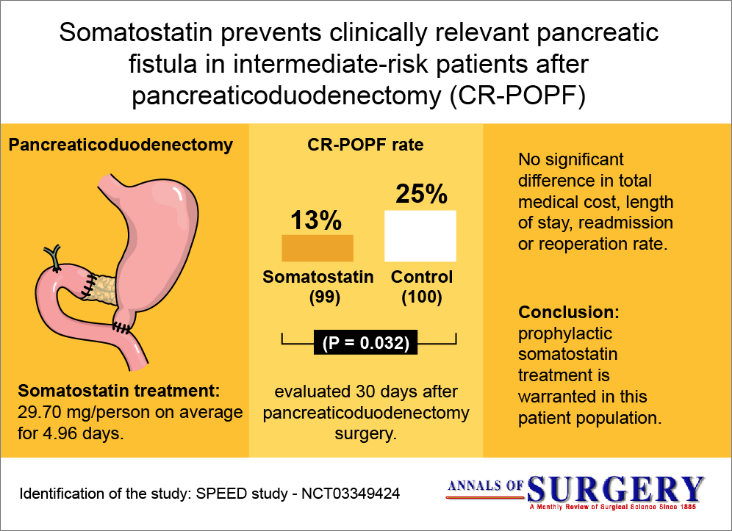
What I need to know to create my graphical abstract for Springer?
The most important information of your paper..
A graphical abstract exists to summarize the content. Do NOT try to put all your data inside a graphical abstract. It is a decoy, to inform the basic and attract the reader for more information.

Read the guidelines of the magazine you want to publish
For all magazines of the Springer group the guidelines are:
- The GA should be 8 cm (3.15 inches) wide x 4 cm (1.57 inches) high when printed at full scale (100%), and should have high quality image and text. Please insure that the illustration maintains this aspect ratio and is still informative upon reduction.
To the size 8 cm (3.15 inches) wide x 4 cm (1.57 inches) you need to set your creation to 500X250 pixels or more. At Mind the graph you can use up to 1500×750 pixels in the graphical abstract format.
- The figure should be in one of the following file types: .tiff, .eps, .jpg, .bmp, .doc, or .pdf. For “rastered” images (.pdf, .doc, .bmp, .jpg), the resolution should be at least 300 dpi.
On Mind the Graph you are able to download in pdf, tiff, and png formats at 300dpi (high resolution).
- Include a short title and description (about 50 words).
The idea of a graphical abstract is to show your data in a visual way, so the focus must be on illustrations, charts, and other visual elements. The text is a secondary element to help the understanding.
Patterned and beautiful illustrations add value to your work.
Well, after years of doing research and getting results it is time to publish. The images and illustrations should be on the same level as your research. Otherwise, it can give an unprofessional to your paper.
Mind the Graph icons Gallery are all scientifically accurate and very beautiful, with clean and modern design. For sure will elevate your work value.
How to use Mind the Graph to create my Springer?
Create an account if you don’t have one yet..
It is very easy to create an account in Mind the Graph. We have a free plan with limited features and watermarked illustrations.
If you choose to be a free user we will not request any credit card or payment information and you can be a free user as long as you want.

I recommend you to start as a free user to give it a try and then subscribe to enjoy all the features and create a very professional graphical abstract.
Go to ‘My Creations’ section and start a new one or choose a template.
My creations page is where all your creations are organized and displayed. Click on one of them to edit or start a new one.

Important: If you are a subscriber, you do not need to start from a blank canvas. Go to our gallery and choose your favorite template.
Set the canva size to the Springer.
The ratio of the width to the height is two to one: 500x250px
Look for illustrations of your field of work.
We have a huge scientific illustration library available. Search by the name or category of illustrations related to your field of work and choose the best for you.
Important: If you don’t find the illustration you need, don’t worry. Subscribers can request new illustrations at no extra cost.
Combine the elements to create a story.
All illustrations from Mind the Graph have a design pattern so you can mix them and have a harmonic creation.

Add text, upload an image and change the background.
Try different colors, fonts and change the size of the elements to see possible arrangements. You can also upload photography or an image of a chart to complete your graphical abstract.

We work to turn this process easy, intuitive, and fun. Check out our tutorial video with step-by-step of the creation process:
Are you ready to try it?

Subscribe to our newsletter
Exclusive high quality content about effective visual communication in science.
Unlock Your Creativity
Create infographics, presentations and other scientifically-accurate designs without hassle — absolutely free for 7 days!
Content tags
IMAGES
VIDEO
COMMENTS
Instructions. Authors must provide an original image that clearly represents the work described in the paper. Graphical abstracts should be submitted as a separate file in the submission system by selecting "graphical abstracts" from the drop-down list when uploading files. Please note that, just as each paper should be unique, so each ...
Find Scientific Illustrations on Mind the Graph's gallery. Back to those three steps: (1) concept, (2) sketch, and (3) design & refine. The first two steps are done on paper, and we only move to graphic design software for the third step. The graphical abstract concept is the very first thing.
1) Scream and damn the day you decided to become an academic (oh the memories…) Time for a ceremonial tossing of all your papers. 2) Design a graphical abstract from scratch (remember, it's half-past midnight already). You decide to dust off your coloured pencils from primary school. 3) Grab the prettiest figure from your paper and pretend ...
4. Maintain consistency. Ensure consistency in style, color scheme, and overall design with the rest of your research article or paper. This helps create a cohesive and professional look, making it easier for readers to associate the graphical abstract with the main content.
A free infographic maker & creator for medical doctors and scientists. Exclusive scientific illustrations, graphs and infographics for your papers, classes and graphical abstracts.
Rule 2: Pictures and pictograms. The key components of every graphical abstract are the visual elements. Most often, graphical abstracts include pictograms or symbols and, less commonly, iconic microscope or photographic images, or data (see #5).Pictograms may also be hand-drawn, but mostly biologists use simple shapes, circles, ellipses, and rectangles, when creating pictograms from scratch.
This is a simple tip to ensure that the GA is in the correct ratio and of high visual quality once online. For Graphical Abstracts published on the MDPI website, the minimum size is 560 × 1100 pixels, with a maximum size of 2800 × 5500 pixels (height × width). Any blank space surrounding the GA must be removed, as this can often be off ...
This should be defined by your journal. If they give you too much freedom, ensure that whatever size you choose has a sufficient resolution at print quality (minimum of 300dpi). Make sure the text is legible without having to zoom in extensively. When in thumbnail view, your graphical abstract shouldn't look too busy.
6 Make sure your abstract can be understood without the paper. In a graphical abstract, space is limited. So keep it simple and don't add more than your conclusion, context, primary outcome (s), and most important methods. In fact, these elements are all you need to form a complete story.
It consists of three steps: (1) concept, (2) sketch, and (3) design & refine. The first two steps are done on paper, and we only move to graphic design software for the third step. The graphical ...
Set the image. A graphical abstract should be one image file to help visualize a single process in a clear and descriptive way. It must have a title and/or three different arguments. Another option would be an introduction, a methodology, and an outcome. It is up to you to choose which one is the best option for your case.
Graphical abstracts are most often created by authors, but some journals make use of social media editors, society staff or designers to create or edit them. If authors create the graphical abstract, it is preferable to request it at revision stage to avoid unnecessary work for the author should their article get rejected.
Step 2. Create a draft of your design by drawing on paper or use digital design tools such as Adobe Illustrator, Affinity Designer, or PowerPoint to arrange your illustrations, text, and graphs. Learn more about graphical abstract design options by clicking on the resources below: Step 3.
Here are our top 10 tips for designing graphical abstracts. 1. Define the Type of Graphical Abstract. A graphical abstract can be designed in many ways. Based on your approach, your final graphical abstract will embody the style and aesthetic that you define for it. When you start designing your abstract, define the type at the very beginning.
Introduction & Background. A graphical abstract (GA) is a graphic and visual summary of the important findings of a scientific article [1]. A GA should enhance a reader's ability to remember and recall information [2]. Recent research shows an eight-fold increase in the sharing of a visual abstract on social media in comparison to text-only ...
Creating a graphical abstract is like playing the game Pictionary, where the player who correctly guesses what is depicted first wins. The player's teammate must rapidly determine the most recognizable way to draw the subject to win. For example, if "cookie" is the chosen subject, then drawing a circle with black dots is a possible solution.
Step 1: Download Free Graphical Abstract Templates. One of the easiest ways to create good graphical abstracts is to start with a template that provides the correct size and framework that makes it easy for you to make an effective design. Use this link to download twenty-four free graphical templates for PowerPoint and Adobe Illustrator.
Another important consideration is where the graphical abstract will be used. If you are submitting to a journal that requires a graphical abstract upon submission, the publisher is most likely planning to display the graphical abstract alongside the article itself on the journal's website. Or they could use it to promote the paper on social ...
The graphical abstract should: Have a clear start and end, "reading" from top‐to‐bottom or left‐to‐right. Provide a visual indication of the biological context of the results depicted (subcellular location, tissue or cell type, species, etc.) Be distinct from any model figures or diagrams included in the paper itself.
A graphical abstract should be a one image file and to help visualize a single process in a clear and descriptive way. For ease of consumption, the graphical abstract should have a clear start and end, preferably "reading" from top to bottom or left to right. Try to minimize distraction and remove cluttering elements as much as possible.
peer review during the paper submission process. The Graphical Abstract must be a concise, illustrative reflection of the content of your paper. It should: • Be a visual or audio highlight of the main point of your paper and represent a microcosm of the full paper. • Include a caption or explanatory note about the visual or audio highlight.
Graphical Abstracts, Research Posters and Scientific Illustrations Visualized In Minutes. Easiest and fastest way to create, share and present research findings effectively. Tidbit helps academic institutions maximize research impact and saves researchers weeks of time, effort and cost savings. Create For Free. Already signed up?
Get a visual overview of a new academic field. Enter a typical paper and we'll build you a graph of similar papers in the field. Explore and build more graphs for interesting papers that you find - soon you'll have a real, visual understanding of the trends, popular works and dynamics of the field you're interested in.
View a PDF of the paper titled Certifying Robustness of Graph Convolutional Networks for Node Perturbation with Polyhedra Abstract Interpretation, by Boqi Chen and 4 other authors. View PDF Abstract: Graph convolutional neural networks (GCNs) are powerful tools for learning graph-based knowledge representations from training data. However, they ...
<abstract> For a graph $ G $, let $ n_G(u, v) $ be the number of vertices of $ G $ that are strictly closer to $ u $ than to $ v $. The distance-unbalancedness index $ {\rm uB}(G) $ is defined as the sum of $ |n_G(u, v)-n_G(v, u)| $ over all unordered pairs of vertices $ u $ and $ v $ of $ G $. In this paper, we show that the minimum distance-unbalancedness of the merged graph $ C_3\cdot T ...
Abstract: Adversarial attacks can fool powerful graph neural networks by subtly modifying input data's graph topology or node attributes. Attackers usually regard the whole graph or local subgraphs as an effective attack strategy in the process of disrupting graph structure. ... Therefore, this paper proposes a new strategy for graph structure ...
At Mind the graph you can use up to 1500×750 pixels in the graphical abstract format. The figure should be in one of the following file types: .tiff, .eps, .jpg, .bmp, .doc, or .pdf. For "rastered" images (.pdf, .doc, .bmp, .jpg), the resolution should be at least 300 dpi. On Mind the Graph you are able to download in pdf, tiff, and png ...